Kosher Salt 2: Sketches

Not being classically trained in comics (is there such a thing?), I’ve been learning as I go. Every time I make a new comic, I learn like a gazillion things that I try to apply the next time I make a comic. So I think my stuff kind of gets exponentially better over time, or I hope it does anyway.

On the other hand, learning-by-doing also means (and I have absolutely mentioned this before) that I seriously hate some of my work that I made not even that long ago.

My second Kosher Salt strip, which you can see in its published version here, is a great example of a comic that taught me a great deal at the time, but that I also hate. Quite a lot.

Luckily, I actually prefer the sketches I did for KS #2 over the final product, so writing this blogpost won’t totally suck. (In case you’re wondering, my main issues with the final comic have to do with poorly implemented color, inaccurate portraiture, and clunky lettering. Moving on.)

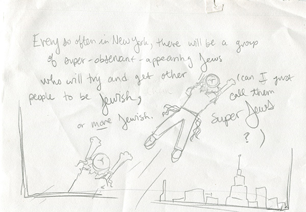
When I first came up with my idea for KS #2, I kind of had the phrase “super Jews” floating around in my head, and I thought maybe it would be funny if I gave them, you know, the superhero treatment.
2-3

But this is a good example of a visual concept that I didn’t end up using AT ALL—not any element of it.

The problem is that the “super Jews” that this comic covers actually irritate me a great deal. And imbuing them with even metaphorical superpowers seemed like I was elevating their proselytizing brand of Jewishness over my own more unassuming brand. Which goes against the whole point of the comic. So I brought them back down to Earth.
2-2

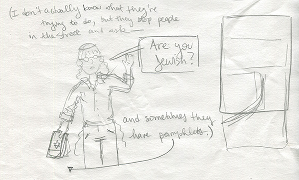
The drawing above is basically what I ended up using, though I threw it into a larger scene, as you can see me start to build on the right.

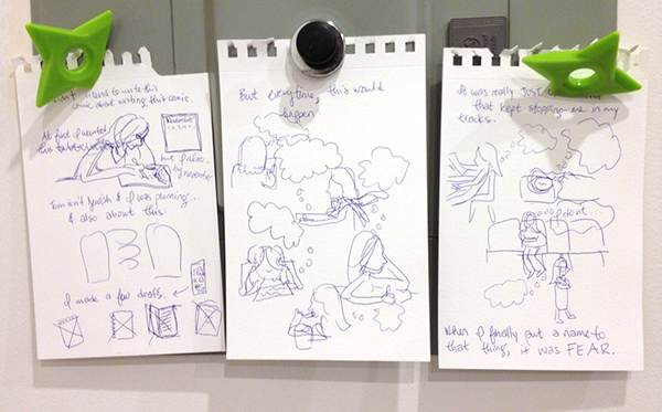
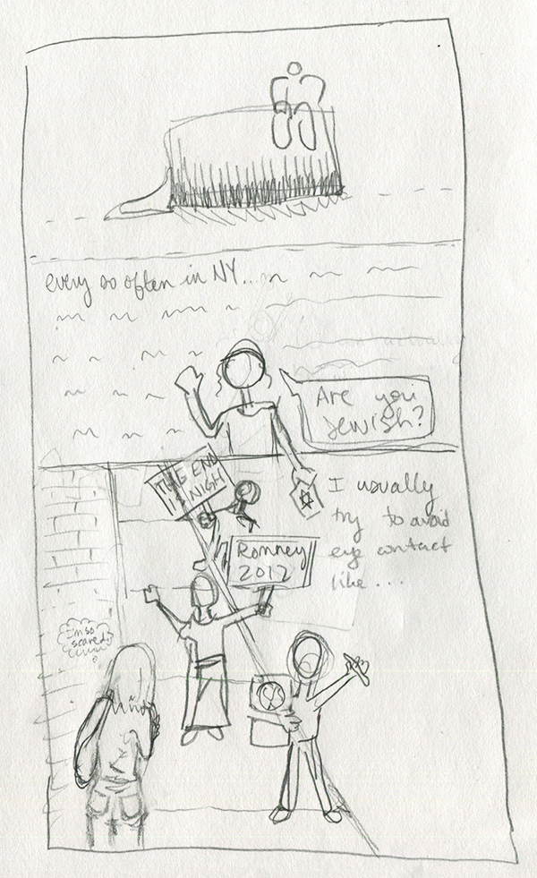
Below I figured out, on my third try, how I would actually format the comic. (Oh, and note how I approximate the title card in my process sketches. Super precise as you can see.)
2-1

I actually didn’t have the “I’m so scared” thought bubble in the final text that I submitted to my editor, but I thought it would be funny, so I added it on the fly.

It’s too bad I have so many issues with the art of this strip, because I like the narrative arc. In fact, when I collect these into some kind of bound something-or-other, I may refresh the art for KS #1-3 to be more up to the standard I established once I’d figured my shit out, more or less. (KS #4-8)
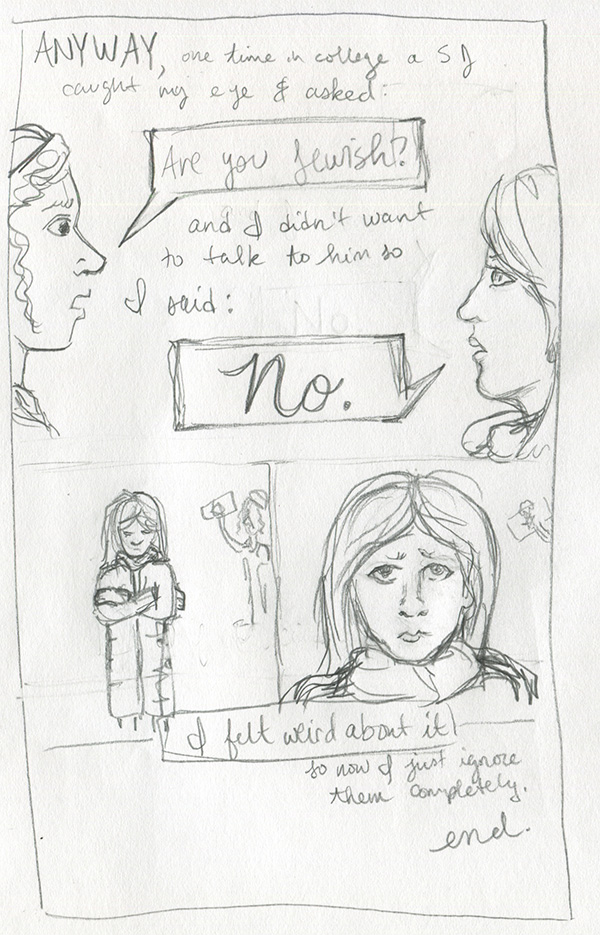
2-4

I kept the ending almost exactly the same, except I got rid of the closeup of my face after you see me hunched over in my coat. I think that when I drew the final one, I felt like another shot of my face wasn’t necessary. Either that or I just was having too much trouble getting the eyes right. The world may never know.
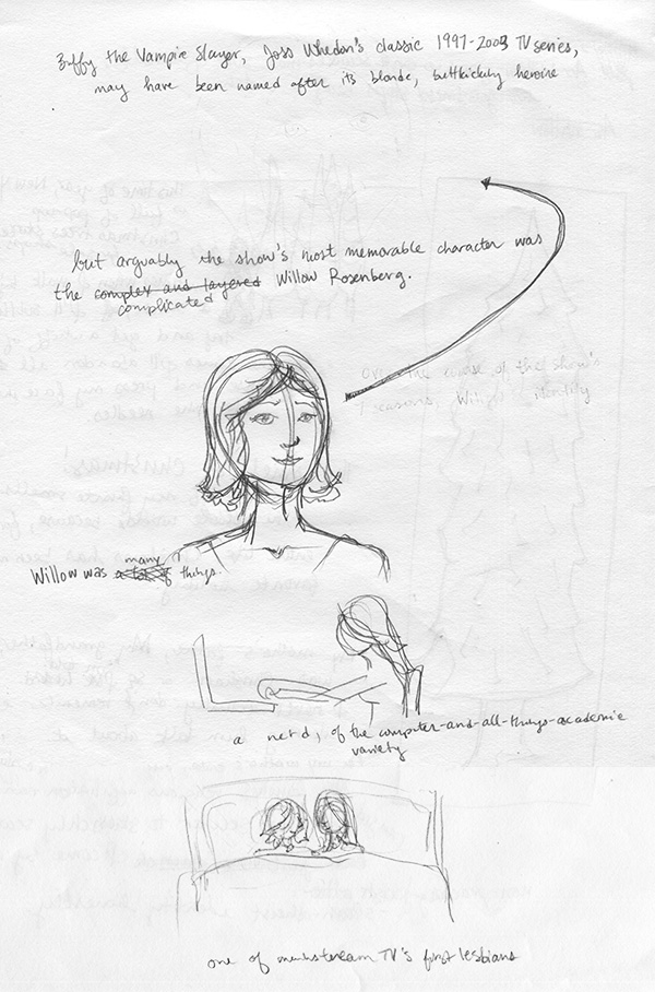
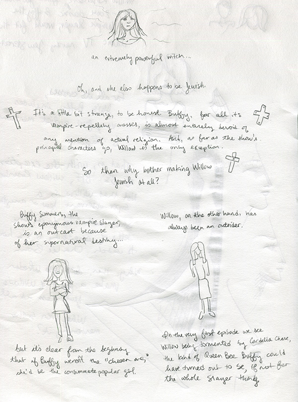
Buffy’s Willow Rosenberg for Jewcy’s Network Jews: sketches

The managing editor of Jewcy is a friend, former co-worker, and fellow Buffy fan, so when she asked me to write something about Willow for their weekly Network Jews feature, I of course said I’d do it.

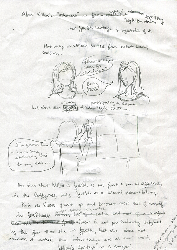
Usually when I make comics, I write out the copy first. Sometimes that involves scrawling rough ideas over entire pages of carefully blocked-out panels that I had intended to fill with storyboard drawings, and sometimes I sit in front of a Google doc for hours, and sometimes I do what I did for my Willow comic. To see what I mean, here is the first and only rough draft I made:

Willow-1

Irritatingly, I actually like the first Willow portrait I drew (above) more than the final one. Sometimes that happens. Oh well.

Anyway, I guess I had been watching a lot of Buffy in preparation for this piece (my fiancé and I are constantly rewatching that show), so my ideas about Willow’s relationship to her Jewish upbringing were pretty fresh in my mind—enough so that I could basically just write the whole thing in longhand from beginning to end.

Willow-3

For the most part, anyway. Usually the part of any comic that is most difficult for me to write is the part where I have to get to some kind of “point.” Like, it would have been really easy just to list things about Willow and then say, “Oh, and she’s also Jewish,” but not make any meaningful connections between anything. To a certain extent, that’s what I did in my first Kosher Salt comic, which is one of the reasons I don’t really like it in retrospect. (Also because, as you can see if you clicked that link, the image quality is absolutely God-awful. But that’s besides the point.)

With Willow, I didn’t really have any meaningful connections or conclusions in mind when I started drawing the comic, so I just kind of wrote whatever was in my head, and then went back and corrected stuff—by hand—when I decided it wasn’t quite right or was actually horrible.

Willow-2

But as you can see, the pictures actually stayed about exactly the same from draft to final piece.

Also, you may notice that I don’t have a draft for the final few frames of the comic, when Willow visits Tara’s grave, and the final drawing of Willow’s hand crackling with magic. It’s because I got frustrated with my obviously haphazard above method and decided just to write the rest of the copy into a GoogleDoc, after which point I drew straight into the final draft.

Oh! Another decision I made that isn’t evident in these drafts was to color only the characters’ hair. Usually I’d reluctantly admit that I did this because it was easier than coloring the whole thing, but in this case it really was totally deliberate. This comic was, first and foremost, a short essay. The focus was supposed to be the words. So I wanted the drawings to complement, but not overpower. Willow’s hair is so distinctive that I thought (and I think it worked!) I could make it clear that these were drawings of HER, not just anyone, by only coloring her hair. Then I decided to do the others’ too, so it would be clear who Buffy was. After all, these drawings are pretty simple and otherwise it might have been hard to tell…

Kosher Salt 8: storyboards

I’ve been slacking on this blog ALREADY (I’m joking; I have had several concurrent deadlines so this current slacking is just a blip, not something that will eventually become permanent. NEVER FEAR!) and part of that was because I was working on my eighth installment of Kosher Salt.

This particular strip was fraught with difficulty throughout my writing/drawing process, but I actually touch on that in the comic itself (I know, meta, right?) so I won’t go into it here for now.

Instead, here is a picture of my Kosher Salt 8 (FINAL version, not the zillions of unused iterations) storyboard sketches:

8-1

As you can see, it’s pretty rough. But also pretty close to the final comic, in general terms.

More detailed posts soon, promise!

Kosher Salt 1: sketches

First of all, I just want to get this out of the way: Some of the pages below have been partially eaten by cats.

Moving on.

Since last May, I’ve been doing a semi-regular comic over at Jewcy called Kosher Salt. Over time it’s become a place for me to write & draw about pretty much anything in my life that relates to the fact that I’m ethnically Jewish, religiously nothing, and culturally a mix of a bunch of different things.

It’s also where I’ve been experimenting with and figuring out how I want to draw comics. I did a pretty inconsistent and haphazard comic with my senior-year roommate back in college, and though it was fun, I didn’t really know what I was doing at the time. It’s only since I started Kosher Salt that I’ve been really intentional with my use of space and movement and lettering and pacing and all those other things that people who draw comics are always talking & thinking about.

(You can see the first strip, which I will be talking about in this post, and which I also kind of have very complicated & mixed feelings about, here.)

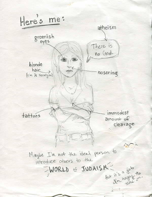
This is one of the first drawings I did for Kosher Salt:

1-1

This is obviously a style that is almost completely different from the kind of stuff I do now. Mainly in the face area. Which I tend, now, to leave almost completely blank. Maybe someday I’ll write a blogpost about THAT. But that’s more complicated than just Kosher Salt so I want to keep going for now…

The next one is also from the first strip:

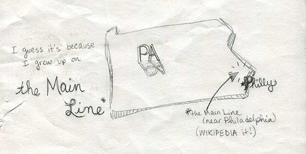
1-3

Looking back on it now, this is kind of a case of over-illustration. One of the tricky things I’ve learned about making comics is that sometimes things should be drawn, and sometimes things should be said (written). I guess that seems pretty obvious, but getting the balance right can be really difficult and I think a bunch of my early Kosher Salts reflect that (in that they failed to do it effectively). Things I’m doing now also sometimes fail, of course, but at least now I’m aware of it, so usually I think I do an okay job at recognizing problem areas in early drafts.

What I mean to say is, in the picture above, I probably didn’t have to draw the entire state of PA. It’s not necessary to get the point across. But at the time I was really concerned with making sure that EVERY WORD had a CORRESPONDING ILLUSTRATION!! In real life and good comics, artists are able to strike a balance. (Here’s an awesome comic by Anne Emond that does exactly that.)

And oh, finally, something I’m actually still happy with (!):

1-2

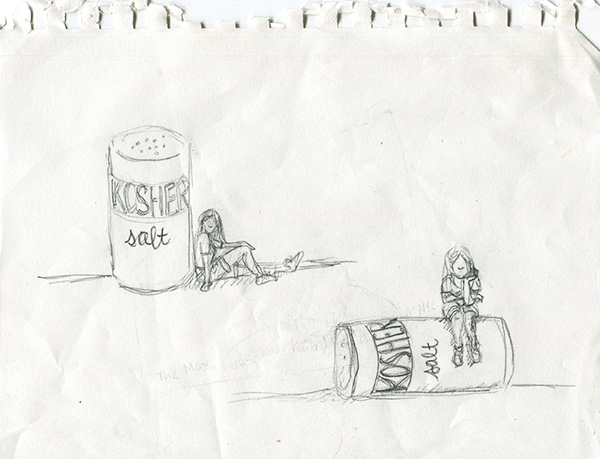
These were my sketches for Kosher Salt’s title card, which has stayed almost exactly the same as the drawing on the bottom since the first strip. I actually mainly ended up choosing the one I did because I have a big tattoo on my left calf, and I wanted it to be visible in the title card. (It’s important because Jews aren’t supposed to get tattoos.) And also I thought the salt-shaker being knocked over fit better with my overall not-quite-fitting-into-Judaism premise.

I didn’t really storyboard my first strip, which is why I don’t have sketches of that in this post. On the other hand, maybe I’m remembering wrong and I did storyboard it, but my cats consumed those pages whole. It’s entirely possible. Thank you for reading!