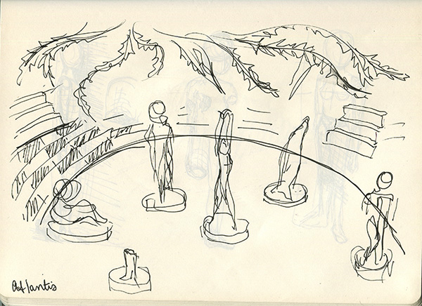
Early Atlantis sketch

atlantis

My Atlantis series of paintings was (is?) based on a single dream I had during the summer of 2011. In the dream I was walking through a forest when it opened into a clearing filled with abandoned and broken but incredibly ornate and beautiful mosaic statues.

Above is the first sketch I made while thinking about how to convey the dream in a painting or series. After struggling for an entire year with the problem of conveying the simultaneous sense of wonder and unease I felt in the dream, I finally decided to depict a series of smaller pieces of the scene rather than try to encompass the entire thing in just one image.

What Is Happening: Hands & Feet & Tentacles Edition

A couple days ago I finally finished Manic Pixel Dream Girl 3, so at least until the next intense deadline I’m all yours, People Who Read My Blog.

Oh, MPDG 3 is going to be published next week, and I will post about it here when that happens! In the meantime, here’s what else I’ve been working on in what little spare time I’ve had. Enjoy!

0. Retronauts Kickstarter Prize!!!: Okay so this isn’t really something I’ve been WORKING ON (which is why I’m numbering it 0), but it’s an announcement I’d like to make anyway. Retronauts is a podcast about old videogames, and it is amazing and brilliant and informative and I’ve been listening to it since 2006 (really!). Unfortunately, Retronauts is now without a home because its parent site, 1up.com, has been shut down.

So Retronauts launched a Kickstarter to continue the podcast, and it has already been funded several times over. “WHY POST ABOUT IT NOW, THEN?!” you may be asking. Well, the Retronauts guys have added a bunch of “stretch goals,” things they will do if they reach certain levels of funding. (For example: At $42,000, which they’ve already reached, they will do two 24-hour livestreams for charity.) And, because they were funded so much more quickly than they expected, they’ve also had to add a whole bunch of new prizes for backers.

MY POINT: At the $250 funding level, backers can choose to receive custom videogame fanart from one of a number of artists, including me! I don’t expect many people reading this will want to drop $250 on Retronauts (though everyone should; they are really a wonderful group of talented people doing an awesome thing), but sharing the Kickstarter or checking out the podcast if you like old videogames does just as much good. And, on the off-chance that you want some custom art by me AND want to donate $250 to a good cause, you can’t go wrong here. ;)

Now on to the drawings…

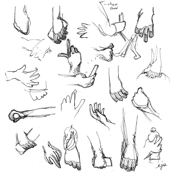
1. Hands: Sometime in the last week or so, I managed to extricate myself from the grasp of Manic Pixel Dream Girl and go outside and take a walk in the park near my apartment. I sat down on a bench for awhile and watched people walk or run or bike past me, and I tried to draw their hands as quickly as I could.

Hands are easy to draw, but very difficult to draw WELL. And there are certain hand positions that are really really common (hanging loose by one’s side; holding a cellphone; holding a water bottle or glass; gesturing while talking) that aren’t super intuitive to draw. Or else I’ll have some idea in my head of what they look like, but that idea is actually pretty far from reality. So I think looking at and drawing an endless parade of hands was a helpful exercise. Here are most of the fruits of my labors:

hands

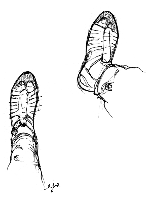
2. Feet: Oh, and feet are fucking impossible to draw; I’m absolutely terrible at them. I plan on doing a similar outing where I just draw feet in the near future, but I’m a bit scared to be honest because good god do I have a hard time with feet. Eventually I will stop being a coward, but for now here are my own feet from when I was sitting on the bench drawing hands. I’m actually happy with how they came out:

feet

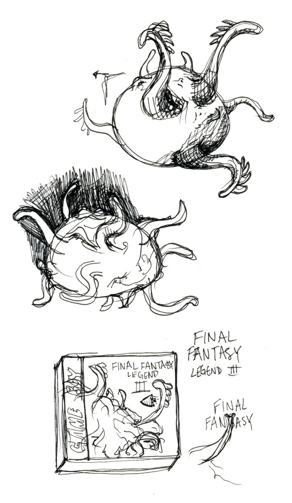
3. Final Fantasy Legend III alternate boxart: One of my fellow Retronauts-volunteer artists, Rusty Shackles, has a blog-project called PaletteSwap, at which he invites artists to submit reinterpretations of videogame boxart. He alerted me to its existence and I think it’s a really awesome idea, so I spent yesterday working on a painting of a new design for the boxart of Final Fantasy Legend III, one of the first RPGs I ever played as a kid. (I wrote a bit about it in MPDG1.)

Rusty prefers that his artists not post their entries on their own blogs until they run on PaletteSwap, and mine will run in two weeks (I’ll post the final version here at that point), so I’ll show you my concept drawings instead for now:

ffl3


This is hopefully just the first of a few of these I’ll do, all centering on an iconic or slightly-overlooked-but-should-be-iconic monster or villain from an RPG. For FF Legend III, I chose to show Xagor, the game’s final boss, in a battle with the Talon, the game’s signature time-travelling airship. I have plans for a couple other games like FF7, FF9, Chrono Cross, and probably some others that are slipping my mind at the moment.

And that’s about it for this post! Next on my list of projects to work on like a crazy person: Finally finishing Lost In Hong Kong. Have a good weekend!

Manic Pixel Dream Girl 1 drawings: second draft

I’m currently in the later stages of completing Manic Pixel Dream Girl 3, so it’s a nice time to look back at MPDG 1 and see how much my process has (or hasn’t) changed since then.

In this post I’ll talk about the second draft of drawings I did for MPDG 1. In case you don’t remember or you didn’t read it, you can find my post on the first draft here. And now, onward!
2-1

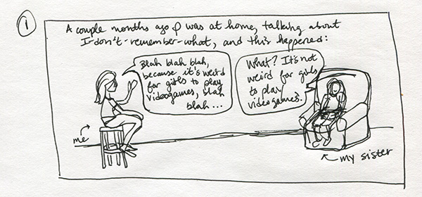
My “complete” second draft for MPDG 1 actually only goes as far as… ALMOST the end, but not quite what the end ended up being. So there are seven “frames,” the first of which is above. I’m really impressed with my own organization… Since this, I’ve gotten a lot LESS strict with myself about creating “official” drafts. There are good and bad things about that, and I actually want to write a post about that later this week, but for now I will stop being openly agog at my own former drafting abilities.
2-2

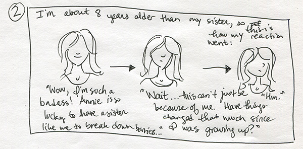
The image above is pretty close to how that part was in the final version. Only I originally envisioned my reaction as progressing horizontally, like it is in this draft. That’s kind of a pattern you’ll notice. I’m so used to reading comics in print that it’s easy to forget, in the draft stage, that I’m not drawing for print; I’m drawing for the internet, which means the mechanic by which readers read is scrolling, not page-turning. And as I think I’ve mentioned before, I try to model myself after amazing especially-for-the-internet comics like this one by Hallie Bateman and this one by Emily Carroll. (You should read that second one aaall the way through to see what I’m talking about!)
2-3

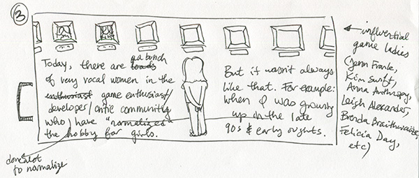
Again, the gallery of influential game ladies started out horizontal, and then I changed it to a staircase to fit the verticality of the medium. I do kind of wish that I could have allowed for the image of me looking at the gallery with my back to the reader, though. I like that (which I had in most early drafts) better than me walking down the stairs, but oh well.

To be fair, I probably would have liked the one of me walking down the stairs better if I had done a better job drawing myself walking down the stairs…
2-4

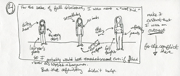
I was originally going to include a much wider range of my own childhood, time-wise, than I did in the final version of MPDG 1. Above I highlighted things about me that were symbols of my “uncool” social status; from left to right, the picture of me is aging from about 8 to about 14. In the end, to keep things clearer and simpler, I made the series more or less chronological, with minimal (and pretty straightforward) flashbacks (flashforwards? I don’t know.). Anyway, the first installment only covered from the age of 8 or so to 11.

It works (I think) that the kinds of things that single you out as being “different” when you’re a child tend to change as you grow up. So what alienated me from my peers at 8 wasn’t necessarily what did it by the time I was 14. Ditto for 18, 22, etc. Categorizing things the way I did above would have smoothed over some of those changes, so I’m glad I didn’t end up doing it that way.

For the record, the final series is organized like this: Part 1 is 2012 then flashback to ~1997-1999 (elementary school); Part 2 is 1999-2002 (middle school); Part 3 is 2012 then flashback to 2002-2006 (high school); and Part 4 will be 2006-nowish (college & after). So structurally, 1/3 and 2/4 are similar, but visually 2/3 and 1/4 are more similar. (Or will be, in the latter’s case.)
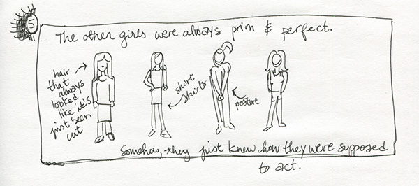
2-5

The “prim and perfect” other girls were always more or less how they are above. In the final comic, I added a contextual scene with a couple of them in a bedroom decorated how I imagined “normal” girls’ bedrooms were decorated back in the late nineties. I don’t think I actually ever went over to a “normal” girl’s house as a child (I had one or two close friends who were almost as weird as I was), so it’s all just conjecture, even now…
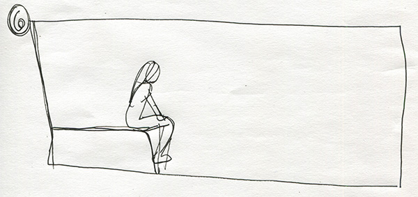
2-6

I have no idea what the above clearly-not-finished frame was supposed to be!

Oh wait I think I do. When I started writing MPDG (as a whole, not in parts), one of the incidents that stood out in my memory was this: The other girls were always talking about the Spice Girls, and my only exposure to them was when I heard them playing in a mall or a restaurant or whatever. I’m still kind of bewildered as to how the other girls even found out about the Spice Girls, or that liking them was the “right” thing to do as girls.

Anyway, I pretended I liked the Spice Girls, or at the very least that I knew who they were and what their music was like. Once I sat on the end of my bed (I’m pretty sure that’s what’s in the frame above) and wrote in one of those journals that was more of an activity book that a secret of mine was that I was “the Spice Girls’ biggest fan.” I had maybe ever heard like one of their songs maybe twice. It was insane! Why would I lie TO MYSELF to make myself seem girlier or more normal or whatever? But I did.

I struggled for a long time with how I would incorporate that anecdote into MPDG because I felt (and still feel) like it was emblematic of so much of how strong and internalized those young feelings of alienation can be, and were. Finally, I found a way to imply the story without beating the reader over the head with it, or telling it in a blow-by-blow style like I just did in the last couple paragraphs. Here’s what I ended up doing, and I’m really proud of it. I think the particular experience of translating that memory from rambling to subtle has been one of the most important lessons for me in storytelling, and how different comics are as a medium from straight text.
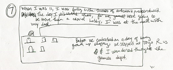
2-7

You’re probably tired of reading this by now, so it’s a good thing I’m at the last panel.

This is again mainly an example of something I ended up changing from primarily horizontal to primarily vertical. I also didn’t include the ending in this draft, which may be because I wasn’t sure what it was going to be yet? Or maybe I was SO sure I didn’t feel the need to storyboard it. I don’t remember.

Anyway, there it is! The second draft (and first FULL draft) of Manic Pixel Dream Girl, Part 1. Hope my lengthy explanations have been helpful rather than irritating and/or tl;dr. Till next time!
Kosher Salt 2: Sketches

Not being classically trained in comics (is there such a thing?), I’ve been learning as I go. Every time I make a new comic, I learn like a gazillion things that I try to apply the next time I make a comic. So I think my stuff kind of gets exponentially better over time, or I hope it does anyway.

On the other hand, learning-by-doing also means (and I have absolutely mentioned this before) that I seriously hate some of my work that I made not even that long ago.

My second Kosher Salt strip, which you can see in its published version here, is a great example of a comic that taught me a great deal at the time, but that I also hate. Quite a lot.

Luckily, I actually prefer the sketches I did for KS #2 over the final product, so writing this blogpost won’t totally suck. (In case you’re wondering, my main issues with the final comic have to do with poorly implemented color, inaccurate portraiture, and clunky lettering. Moving on.)

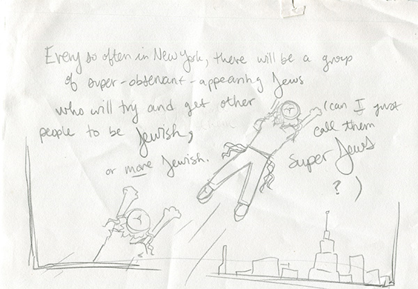
When I first came up with my idea for KS #2, I kind of had the phrase “super Jews” floating around in my head, and I thought maybe it would be funny if I gave them, you know, the superhero treatment.

2-3

But this is a good example of a visual concept that I didn’t end up using AT ALL—not any element of it.

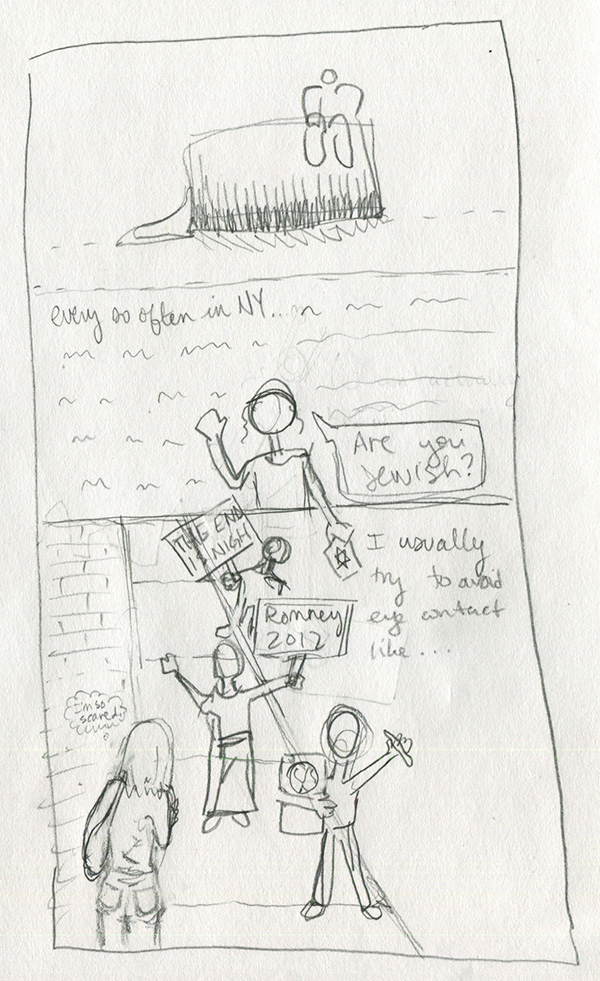
The problem is that the “super Jews” that this comic covers actually irritate me a great deal. And imbuing them with even metaphorical superpowers seemed like I was elevating their proselytizing brand of Jewishness over my own more unassuming brand. Which goes against the whole point of the comic. So I brought them back down to Earth.

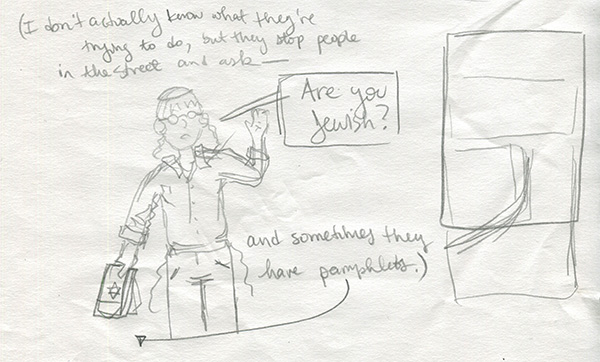
2-2

The drawing above is basically what I ended up using, though I threw it into a larger scene, as you can see me start to build on the right.

Below I figured out, on my third try, how I would actually format the comic. (Oh, and note how I approximate the title card in my process sketches. Super precise as you can see.)

2-1

I actually didn’t have the “I’m so scared” thought bubble in the final text that I submitted to my editor, but I thought it would be funny, so I added it on the fly.

It’s too bad I have so many issues with the art of this strip, because I like the narrative arc. In fact, when I collect these into some kind of bound something-or-other, I may refresh the art for KS #1-3 to be more up to the standard I established once I’d figured my shit out, more or less. (KS #4-8)

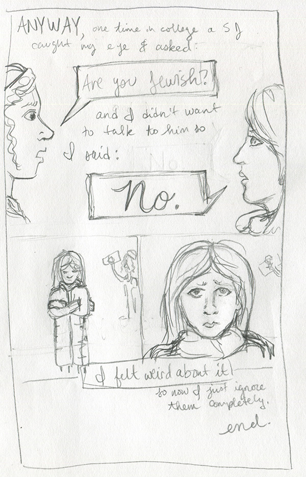
2-4

I kept the ending almost exactly the same, except I got rid of the closeup of my face after you see me hunched over in my coat. I think that when I drew the final one, I felt like another shot of my face wasn’t necessary. Either that or I just was having too much trouble getting the eyes right. The world may never know.

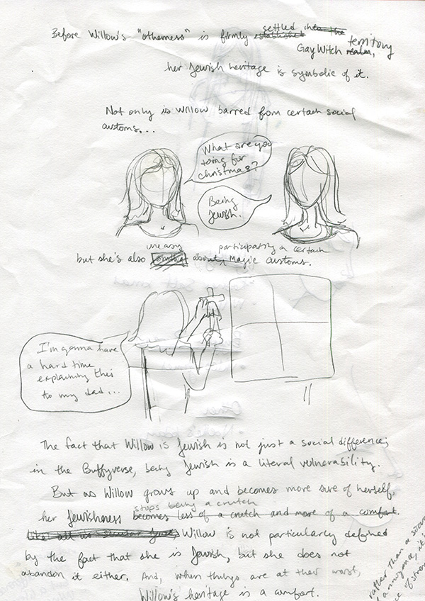
Buffy’s Willow Rosenberg for Jewcy’s Network Jews: sketches

The managing editor of Jewcy is a friend, former co-worker, and fellow Buffy fan, so when she asked me to write something about Willow for their weekly Network Jews feature, I of course said I’d do it.

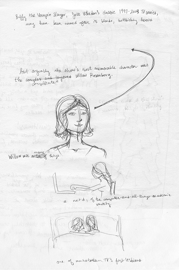
Usually when I make comics, I write out the copy first. Sometimes that involves scrawling rough ideas over entire pages of carefully blocked-out panels that I had intended to fill with storyboard drawings, and sometimes I sit in front of a Google doc for hours, and sometimes I do what I did for my Willow comic. To see what I mean, here is the first and only rough draft I made:

Willow-1

Irritatingly, I actually like the first Willow portrait I drew (above) more than the final one. Sometimes that happens. Oh well.

Anyway, I guess I had been watching a lot of Buffy in preparation for this piece (my fiancé and I are constantly rewatching that show), so my ideas about Willow’s relationship to her Jewish upbringing were pretty fresh in my mind—enough so that I could basically just write the whole thing in longhand from beginning to end.

Willow-3

For the most part, anyway. Usually the part of any comic that is most difficult for me to write is the part where I have to get to some kind of “point.” Like, it would have been really easy just to list things about Willow and then say, “Oh, and she’s also Jewish,” but not make any meaningful connections between anything. To a certain extent, that’s what I did in my first Kosher Salt comic, which is one of the reasons I don’t really like it in retrospect. (Also because, as you can see if you clicked that link, the image quality is absolutely God-awful. But that’s besides the point.)

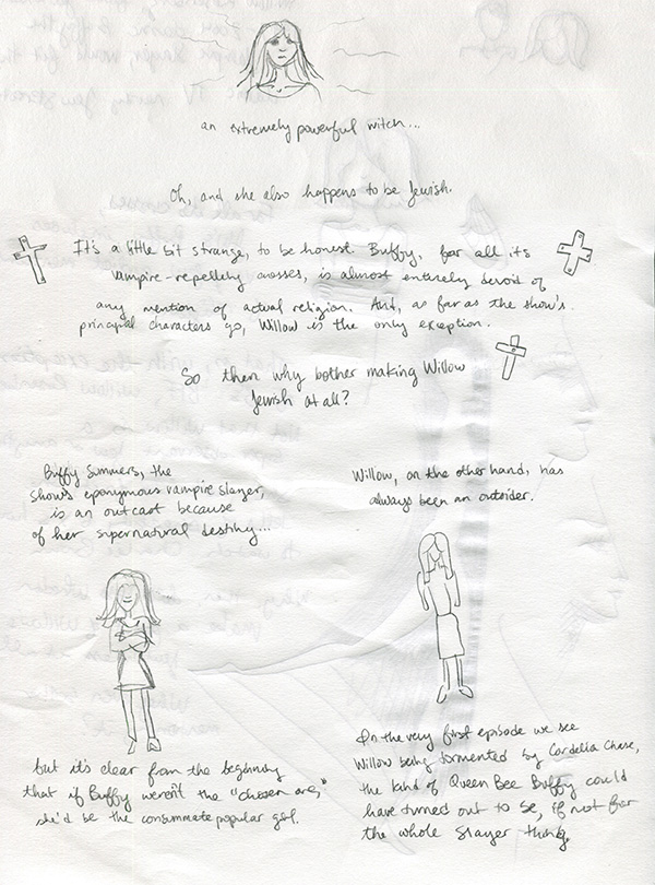
With Willow, I didn’t really have any meaningful connections or conclusions in mind when I started drawing the comic, so I just kind of wrote whatever was in my head, and then went back and corrected stuff—by hand—when I decided it wasn’t quite right or was actually horrible.

Willow-2

But as you can see, the pictures actually stayed about exactly the same from draft to final piece.

Also, you may notice that I don’t have a draft for the final few frames of the comic, when Willow visits Tara’s grave, and the final drawing of Willow’s hand crackling with magic. It’s because I got frustrated with my obviously haphazard above method and decided just to write the rest of the copy into a GoogleDoc, after which point I drew straight into the final draft.

Oh! Another decision I made that isn’t evident in these drafts was to color only the characters’ hair. Usually I’d reluctantly admit that I did this because it was easier than coloring the whole thing, but in this case it really was totally deliberate. This comic was, first and foremost, a short essay. The focus was supposed to be the words. So I wanted the drawings to complement, but not overpower. Willow’s hair is so distinctive that I thought (and I think it worked!) I could make it clear that these were drawings of HER, not just anyone, by only coloring her hair. Then I decided to do the others’ too, so it would be clear who Buffy was. After all, these drawings are pretty simple and otherwise it might have been hard to tell…

Life changes & exciting new things

Hello!

You may have noticed that I have been keeping a low profile for a couple weeks (also known as “neglecting my blog” but why use such language?). So here’s an update on what’s been going on:

First off, I left my day-job, and I wanted to spend the last couple weeks tying up all my loose ends there. Especially being secure in the knowledge that, when I was finished, I’d be able to devote ALL OF MY TIME to making art & comics & (hopefully) comics that are art.

So now that’s what’s happening: I am going to try my luck at being a full-time artist & illustrator for awhile. If it works out, I’ll be doing it forever. Obviously that’s what I’m hoping for, because as you may have realized, I really really REALLY love drawing and painting, and I want to be able to do what I love.

In the next few months (and hopefully much longer), I’ll be working hard at getting myself off the ground art-wise. I have loads of ideas and plans for various graphic memoirs and paintings and even fictional comics, possibly zines or booklets, definitely prints, and so on. As I work on those things, I’ll be posting progress sketches and the like here, as usual, as well as notes whenever something is published.

If you want to help me fulfill my hopes and dreams & be able to continue creating stuff indefinitely, first of all that makes me really happy. :) And second of all, here are some things you can do:

  • Follow me on twitter.
  • Read this blog & share any posts you particularly like.
  • Get in touch if you need illustrations or other artwork done and you think my work would be a good fit.
  • Keep up with my portfolio, which I update regularly with finished versions of things that I post here while they are in-progress.

Otherwise, just keep being wonderful and supportive, which I assume you are if you made it to the end of this post!

Thanks for reading & wish me luck!
Elizabeth

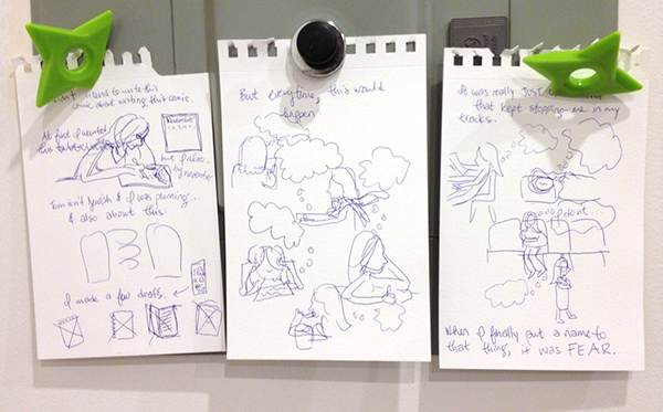
Kosher Salt 8: storyboards

I’ve been slacking on this blog ALREADY (I’m joking; I have had several concurrent deadlines so this current slacking is just a blip, not something that will eventually become permanent. NEVER FEAR!) and part of that was because I was working on my eighth installment of Kosher Salt.

This particular strip was fraught with difficulty throughout my writing/drawing process, but I actually touch on that in the comic itself (I know, meta, right?) so I won’t go into it here for now.

Instead, here is a picture of my Kosher Salt 8 (FINAL version, not the zillions of unused iterations) storyboard sketches:

8-1

As you can see, it’s pretty rough. But also pretty close to the final comic, in general terms.

More detailed posts soon, promise!

Kosher Salt 1: sketches

First of all, I just want to get this out of the way: Some of the pages below have been partially eaten by cats.

Moving on.

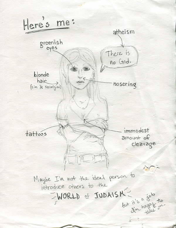
Since last May, I’ve been doing a semi-regular comic over at Jewcy called Kosher Salt. Over time it’s become a place for me to write & draw about pretty much anything in my life that relates to the fact that I’m ethnically Jewish, religiously nothing, and culturally a mix of a bunch of different things.

It’s also where I’ve been experimenting with and figuring out how I want to draw comics. I did a pretty inconsistent and haphazard comic with my senior-year roommate back in college, and though it was fun, I didn’t really know what I was doing at the time. It’s only since I started Kosher Salt that I’ve been really intentional with my use of space and movement and lettering and pacing and all those other things that people who draw comics are always talking & thinking about.

(You can see the first strip, which I will be talking about in this post, and which I also kind of have very complicated & mixed feelings about, here.)

This is one of the first drawings I did for Kosher Salt:

1-1

This is obviously a style that is almost completely different from the kind of stuff I do now. Mainly in the face area. Which I tend, now, to leave almost completely blank. Maybe someday I’ll write a blogpost about THAT. But that’s more complicated than just Kosher Salt so I want to keep going for now…

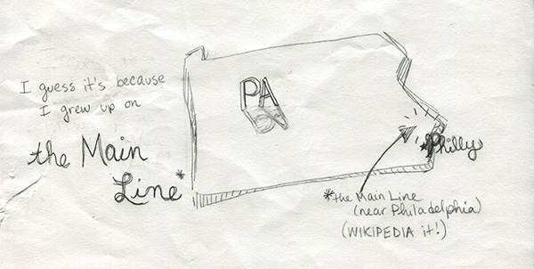
The next one is also from the first strip:

1-3

Looking back on it now, this is kind of a case of over-illustration. One of the tricky things I’ve learned about making comics is that sometimes things should be drawn, and sometimes things should be said (written). I guess that seems pretty obvious, but getting the balance right can be really difficult and I think a bunch of my early Kosher Salts reflect that (in that they failed to do it effectively). Things I’m doing now also sometimes fail, of course, but at least now I’m aware of it, so usually I think I do an okay job at recognizing problem areas in early drafts.

What I mean to say is, in the picture above, I probably didn’t have to draw the entire state of PA. It’s not necessary to get the point across. But at the time I was really concerned with making sure that EVERY WORD had a CORRESPONDING ILLUSTRATION!! In real life and good comics, artists are able to strike a balance. (Here’s an awesome comic by Anne Emond that does exactly that.)

And oh, finally, something I’m actually still happy with (!):

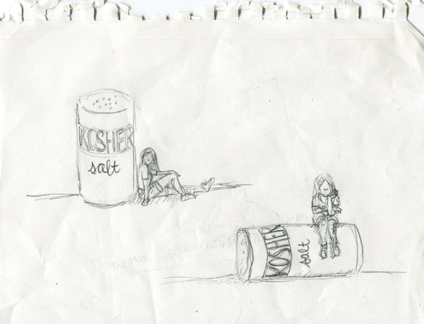
1-2

These were my sketches for Kosher Salt’s title card, which has stayed almost exactly the same as the drawing on the bottom since the first strip. I actually mainly ended up choosing the one I did because I have a big tattoo on my left calf, and I wanted it to be visible in the title card. (It’s important because Jews aren’t supposed to get tattoos.) And also I thought the salt-shaker being knocked over fit better with my overall not-quite-fitting-into-Judaism premise.

I didn’t really storyboard my first strip, which is why I don’t have sketches of that in this post. On the other hand, maybe I’m remembering wrong and I did storyboard it, but my cats consumed those pages whole. It’s entirely possible. Thank you for reading!

Concept for a small piece of a large (secret) project

rsideorder

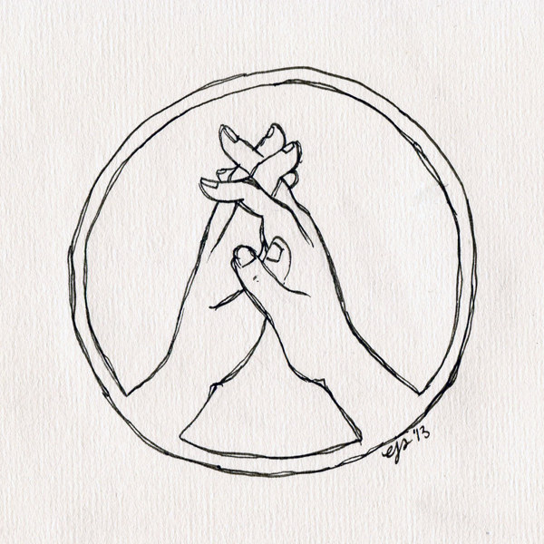
I’m working on kind of an extensive project (spoiler: it’s a comic.. thing) with a friend of mine. Here is a concept for a seal or crest from aforementioned Secret Project.

Eventually, I’d like to make the edges a little more ornate & distinctive, but what was important to get done at this stage was the basic composition of the circle. Decorative stuff will come later… Also I have no idea yet what the colors are going to be for this. I haven’t yet decided if they should be somewhat naturalistic or very logo-ish like maybe just two colors total (the hands and border white, for example, and the negative space black). Maybe next time I post this or another crest I’ll have figured that out….

(I’ll definitely be posting lots more cryptic stuff from Secret Project in the next few months… It has begun to consume a nice-sized chunk of my life.)

Manic Pixel Dream Girl drawings: first draft

The Bygone Bureau recently published part-one-of-eventually-four of my comic, Manic Pixel Dream Girl. I’ve been thinking about writing something about growing up as a girl who played videogames for awhile now (like four or five years), so when I finally decided to get to work, it took me a long time to distill all my ideas down to something that made sense and that I was happy with. As a result, there are A LOT of different drafts & versions of MPDG1.

Here’s the first version, which I did around Thanksgiving:

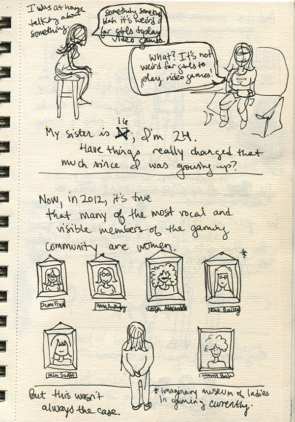
1-2

Those panels (though they weren’t such defined “panels” in the final comic) actually stayed pretty similar, though I did end up making the “imaginary museum of ladies in gaming currently” into something more like a gallery on a staircase so there would be some feeling of movement, which I think is important for the medium (of internet comic). I owe a lot to the Bygone Bureau’s Hallie Bateman for exemplifying that internet-comic-vertical-movement idea in her work. Her Cemetery Wonderland is something I look at CONSTANTLY when I’m drawing comics.

Anyway! Next page:

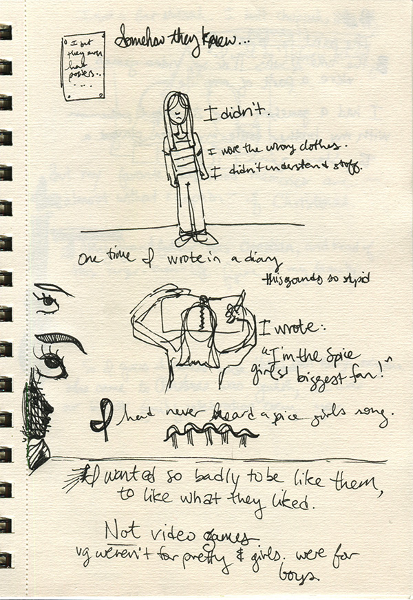
1-1

These, on the other hand, were way more nebulous and took a lot longer to solidify in my head, and also on paper. I especially had a REALLY hard time figuring out how to convey the childhood lunacy that caused me to lie to myself in my own diaries. I worked through probably like five versions of that “scene” in my life before it clicked for me. And I’m happy with how it turned out.

I was going to post MORE of my process sketches for MPDG in this post, but I didn’t want to overwhelm y’all this early on! I will follow this up with other versions & drafts.