But, until I do, please follow me on twitter or tumblr instead. <3
Author Archives: Elizabeth
New art; old videogames
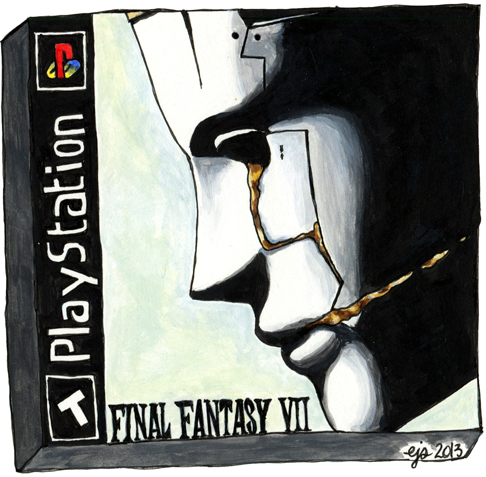
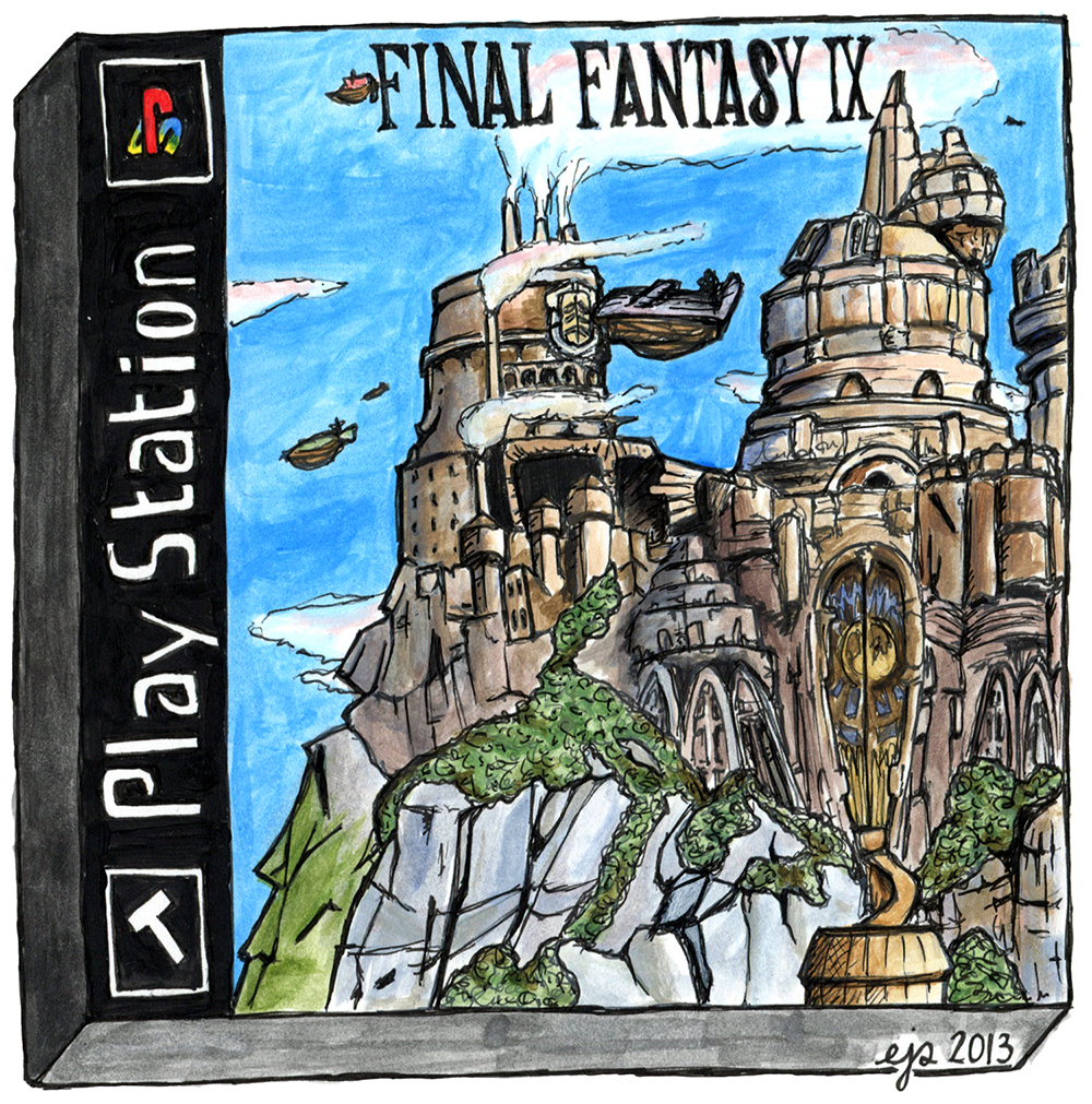
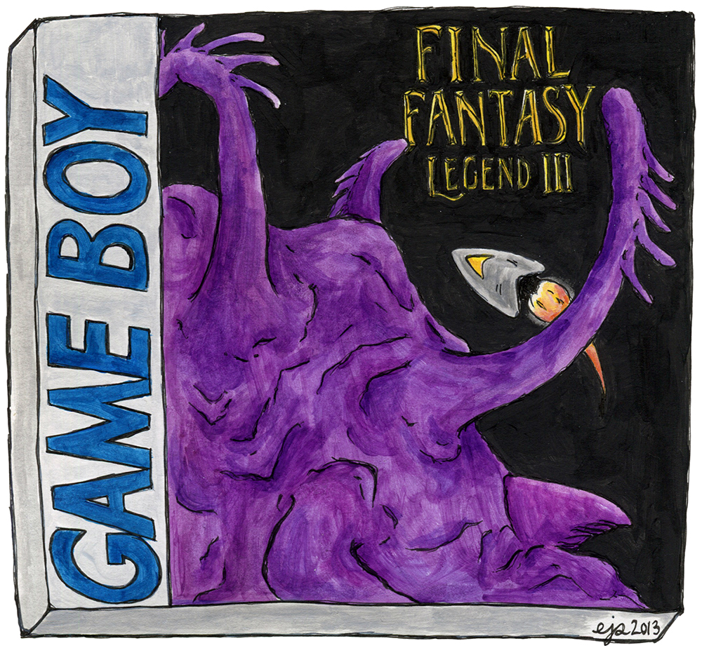
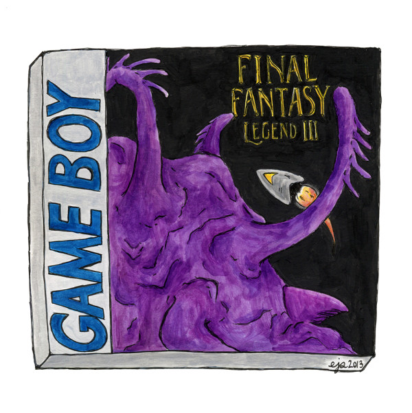
This week, I had three entries run on Rusty Shackles’s awesome art/games blog, PaletteSwap, on which he invites artists to reinterpret videogame box art.
Below are my takes on Final Fantasy VII, Final Fantasy IX, and (in case you missed it when I posted earlier this week) Final Fantasy Legend III. Enjoy!
Early Atlantis sketch
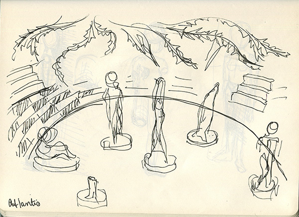
My Atlantis series of paintings was (is?) based on a single dream I had during the summer of 2011. In the dream I was walking through a forest when it opened into a clearing filled with abandoned and broken but incredibly ornate and beautiful mosaic statues.
Above is the first sketch I made while thinking about how to convey the dream in a painting or series. After struggling for an entire year with the problem of conveying the simultaneous sense of wonder and unease I felt in the dream, I finally decided to depict a series of smaller pieces of the scene rather than try to encompass the entire thing in just one image.
What Is Happening: Line Drawings, So Many Line Drawings
I was in Maine and Connecticut for various reasons last week, so I’ve saved up a fair number of drawings and things that I haven’t posted on here yet. Also, I’m launching a new regular comic tomorrow BUT because it is launching tomorrow and I have all this unposted stuff, blah blah blah I’m going to go ahead and wait till tomorrow to talk about that.
So here’s what I’ve been up to.
1. Final Fantasy Legend III PaletteSwap: An artist who does really awesome things, Rusty Shackles, invited me to submit to his PaletteSwap blog, on which artists reinterpret videogame cover art. I did three, all of which are going to be posted this week! It is exciting. Here’s the first one:
And you should go check out the whole blog, because it is full of excellent videogame-related art. Oh! And you can buy an art print of the one above, if you’re interested!
2. Content-aware studies: I’ve been planning on doing a series of non-comic-related paintings based on the weird deformations that sometimes happen in Photoshop when you use the “content-aware” fill tool.
Basically, the content-aware fill is for if you have like… Okay say you have a picture of the sky with a bunch of clouds, and there’s a smudge or a bird or something in the middle of one of them, and you don’t want it there. You can select that area and use content-aware fill on it, and that should “smart” fill it, so it will look seamless and like the bird/smudge was never there and it was always just a sky full of clouds.
That may have been a needlessly complicated explanation. Anyway the point is that sometimes the content-aware tool glitches, and if it does so near an image of a person, sometimes it can get really weird and creepy and gruesome.
So I have a bunch of these content-aware deformations saved, and eventually I plan on painting them. The two sketches above are just studies! And they are the first I’ve done.
3. Final Fantasy IX’s Lindblum: Final Fantasy IX is my favorite game of all time. (I wrote about it a whole bunch in Manic Pixel Dream Girl 2, if you missed it!) I’ve done a lot of drawings of things from FF9, but my favorite thing to draw is the game’s largest city, Lindblum.
Here’s a study I sketched last week, for another one of the alternate cover arts I did:
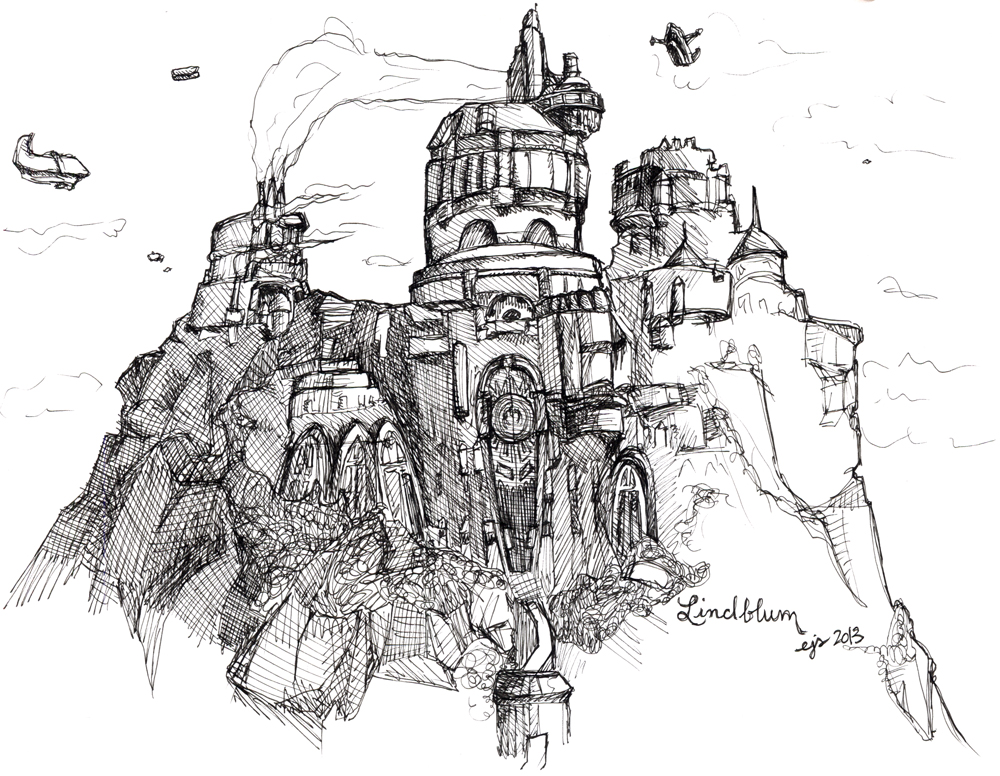
And, for comparison I guess, here’s a little painting I did of Lindblum like two years ago:
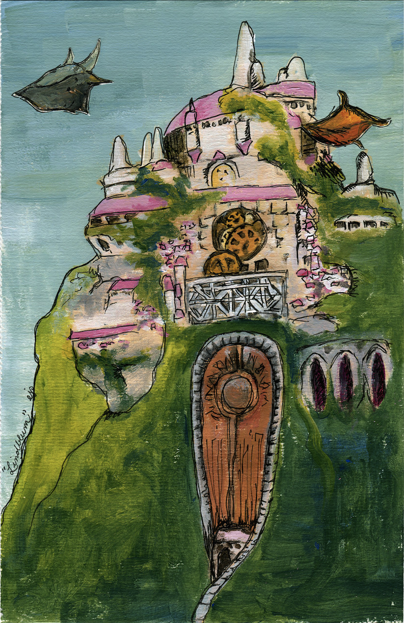
That was from way before I’d become comfortable with my current painting process. I think I actually used gouache, which is WAY too expensive to use regularly. Now I use acrylic, very very watered down. Also I’m a lot less afraid of putting in lots of details now, just because I’m more practiced. For example, the line drawing above I drew in one go with a pen, over the course of an hour or two. The painting I did in like a hundred steps… Pencil, pen, paint, like 3 more layers of paint, then pen again. And as you can see, even after all those steps, it’s still less detailed and the architecture is a bit off.
I like the colors though. One of the first paintings I ever did that I was REALLY happy with, so even though it’s easy to criticize in retrospect, I still kinda like it.
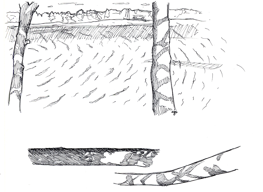
4. Trees on Lake Pemaquid: No, you’re not going to escape my post-Maine blogpost without some drawings of Maine. I drew some trees over a lake. In context, and then just some random trees there at the bottom.
Okay, that’s it for now! Big announcement about a new comic, coming tomorrow! :)
Giant XXL Special Edition MoCCA Fest Blogstravaganza!
I’ve actually been drawing quite a bit over the past few days, but I’ve been doing so in Maine, where I sadly don’t have access to my scanner. Luckily, I still haven’t blogged EVEN ONCE about the wonderfulness that was my experience at MoCCA Fest NYC last weekend. So this is the perfect opportunity to do that.
Last Saturday, I intended just to “stop by” MoCCA Fest, but I accidentally stayed for about four hours. I talked to a whole bunch of artists all of whom are doing really interesting things in the intersecting worlds of comics and illustration. I also bought a metric shitload of comics:
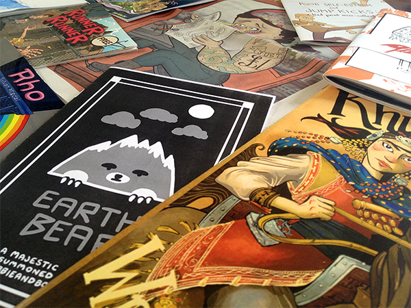
Keep in mind, none of these cost more than $5, and most were $1 or $2, and some were free.
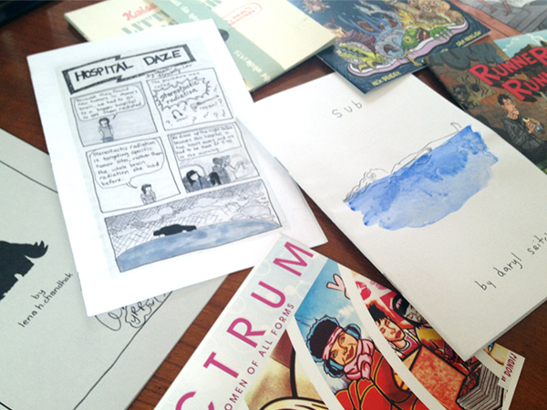
And that’s not even everything…
I’ll probably end up doing more posts on some of the comics and, especially, ideas I acquired at MoCCA Fest, but for now I just want to do a round-up of some of the cooler stuff I ended up with. (Generally the reason I have dubbed these comics “cooler stuff” is because they are in richly-printed color, which tends to make my eyes pop out of my head, in a good way, and I do most of my comics in color, so I’m always looking for tips on how to successfully make the transition to print.)
Okay! Let’s go.
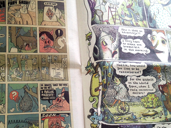
Above is just ONE SPREAD from an issue of the Comix Reader, an ongoing series of anthologies, printed on newsprint, in which each of 20 participating artists gets one page to do with whatever he or she wants. It’s committed to being fun and iconoclastic and hilarious… and it is all of those things. Also, it’s sold for just $1/issue, which means I bought all four that have been published. Aaaand I will absolutely be doing a post dedicated just to these so I’ll move on to the next thing for now. Suffice it to say that the Comix Reader is fucking fantastic.
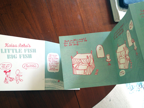
This one, by Kaisa Leka, is kind of important to me because its form is so interesting. Little Fish Big Fish is printed on both sides of a long accordion-style book, which is something I’m considering exploring for print publications of my own. I found it at a table dedicated to Finnish comics, and it smells like an empty crayon box, which is a bit weird but not necessarily a bad thing.
I asked the woman who was tending the table how exactly Little Fish Big Fish was printed and she said it was done on a couple long pieces of card stock, then folded and glued together by hand. Very intriguing.
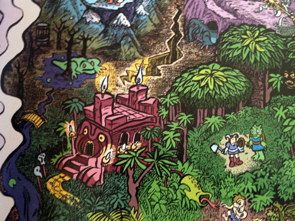
This is a tiny bit of a BEAUTIFUL comic (drawn by Ellis Rosen and colored by Sam Marlow) called HomeQuest. It’s a satire of fantasy quest narratives, especially those found in kind of your run-of-the-mill RPGs, my personal favorite genre of videogame.
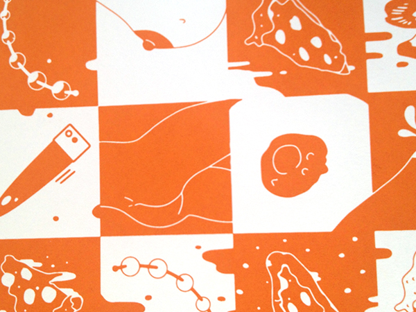
Okay in service of not making this post entirely NSFW, I am only including a small piece of the cover of this anthology which is descriptively titled Pizza and Sex. Inside you can find short comics and visual narratives by a bunch of artists, all about, well… pizza and sex. Some stories have people having sex and eating pizza; some are having sex WITH pizza; there’s also some pizza having sex with other pizza. Basically it’s hilarious, and a well-orchestrated example of a ridiculous concept that ends up inspiring some pretty excellent art.
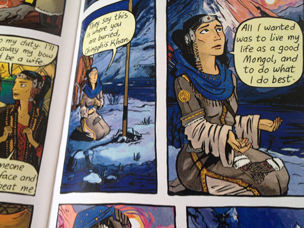
On a um… completely different note, Here’s a part of one of the many gorgeous pages in Molly Ostertag‘s Khutulun, which is based on the true story of a Mongolian princess-slash-warrior. (This is the same artist who does the visuals for the ongoing webcomic Strong Female Protagonist.)
I talked to Ostertag about her process, because I fell in love with her art style—specifically the really delicate-yet-bold way that she colors her work. It turns out she colors in Photoshop! This blew my mind a bit, because I am such a proponent of doing things “the old-fashioned way” when it comes to painting (for my own work; I definitely don’t look down on other people’s methods, regardless of what they are!). Not that I’m going to stop using actual physical paint any time soon, but I am super impressed with how real-actual-paint-ish many artists can make their Photoshop-painting look.
Above is a tiny, hysterical piece of Sylvan Migdal‘s Rho. Oh uh… that link is probably NSFW. Sorry bout that.
Anyway, I was already familiar with Migdal’s work on (definitely NSFW) Curvy, which is a lovely, smutty sci-fi/fantasy adventure story. Thing is, I actually was sure that Migdal, who sometimes goes by the pen-name M. Magdalene, was a woman! Maybe it’s just because there are so many different types of queer ladies in Curvy. But when I saw Migdal at his table at MoCCA Fest, I said “Oh, I like Curvy,” and he was like, “Thanks!” and of course I immediately said, “YOU did Curvy?? I thought you were a woman!”
Everyone at the table thought that was pretty funny. Comics: defying gender stereotypes!
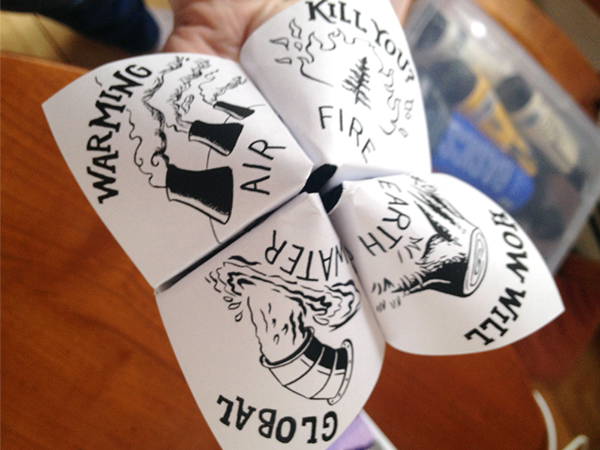
You’ll notice that this last thing isn’t in color. It also isn’t really a comic. But it IS a fortune-teller about global warming. So obviously I had to buy it.
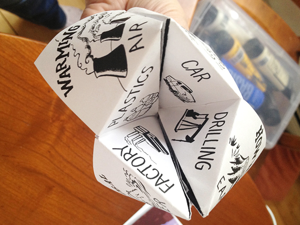
It came in a $2 “grab bag” of comics by Hazel Newlevant.
Whew. Okay, that’s enough for now. I’ll be sure to go into more detail about individual comics at some point, as well as talk about various things I learned from talking to all those artists, other than what I briefly mentioned above. More soon!
Manic Pixel Dream Girl 3
What Is Happening: Hands & Feet & Tentacles Edition
A couple days ago I finally finished Manic Pixel Dream Girl 3, so at least until the next intense deadline I’m all yours, People Who Read My Blog.
Oh, MPDG 3 is going to be published next week, and I will post about it here when that happens! In the meantime, here’s what else I’ve been working on in what little spare time I’ve had. Enjoy!
0. Retronauts Kickstarter Prize!!!: Okay so this isn’t really something I’ve been WORKING ON (which is why I’m numbering it 0), but it’s an announcement I’d like to make anyway. Retronauts is a podcast about old videogames, and it is amazing and brilliant and informative and I’ve been listening to it since 2006 (really!). Unfortunately, Retronauts is now without a home because its parent site, 1up.com, has been shut down.
So Retronauts launched a Kickstarter to continue the podcast, and it has already been funded several times over. “WHY POST ABOUT IT NOW, THEN?!” you may be asking. Well, the Retronauts guys have added a bunch of “stretch goals,” things they will do if they reach certain levels of funding. (For example: At $42,000, which they’ve already reached, they will do two 24-hour livestreams for charity.) And, because they were funded so much more quickly than they expected, they’ve also had to add a whole bunch of new prizes for backers.
MY POINT: At the $250 funding level, backers can choose to receive custom videogame fanart from one of a number of artists, including me! I don’t expect many people reading this will want to drop $250 on Retronauts (though everyone should; they are really a wonderful group of talented people doing an awesome thing), but sharing the Kickstarter or checking out the podcast if you like old videogames does just as much good. And, on the off-chance that you want some custom art by me AND want to donate $250 to a good cause, you can’t go wrong here. ;)
Now on to the drawings…
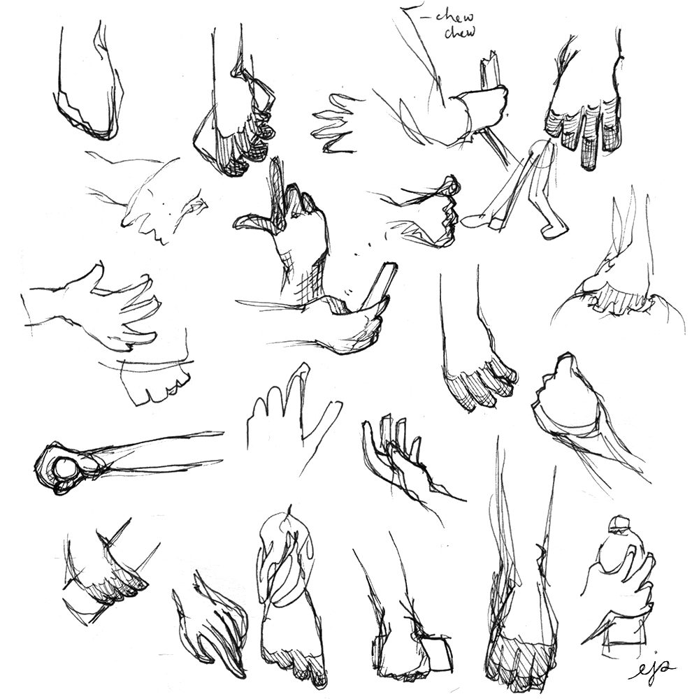
1. Hands: Sometime in the last week or so, I managed to extricate myself from the grasp of Manic Pixel Dream Girl and go outside and take a walk in the park near my apartment. I sat down on a bench for awhile and watched people walk or run or bike past me, and I tried to draw their hands as quickly as I could.
Hands are easy to draw, but very difficult to draw WELL. And there are certain hand positions that are really really common (hanging loose by one’s side; holding a cellphone; holding a water bottle or glass; gesturing while talking) that aren’t super intuitive to draw. Or else I’ll have some idea in my head of what they look like, but that idea is actually pretty far from reality. So I think looking at and drawing an endless parade of hands was a helpful exercise. Here are most of the fruits of my labors:
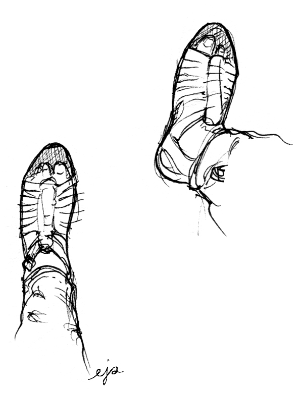
2. Feet: Oh, and feet are fucking impossible to draw; I’m absolutely terrible at them. I plan on doing a similar outing where I just draw feet in the near future, but I’m a bit scared to be honest because good god do I have a hard time with feet. Eventually I will stop being a coward, but for now here are my own feet from when I was sitting on the bench drawing hands. I’m actually happy with how they came out:
3. Final Fantasy Legend III alternate boxart: One of my fellow Retronauts-volunteer artists, Rusty Shackles, has a blog-project called PaletteSwap, at which he invites artists to submit reinterpretations of videogame boxart. He alerted me to its existence and I think it’s a really awesome idea, so I spent yesterday working on a painting of a new design for the boxart of Final Fantasy Legend III, one of the first RPGs I ever played as a kid. (I wrote a bit about it in MPDG1.)
Rusty prefers that his artists not post their entries on their own blogs until they run on PaletteSwap, and mine will run in two weeks (I’ll post the final version here at that point), so I’ll show you my concept drawings instead for now:
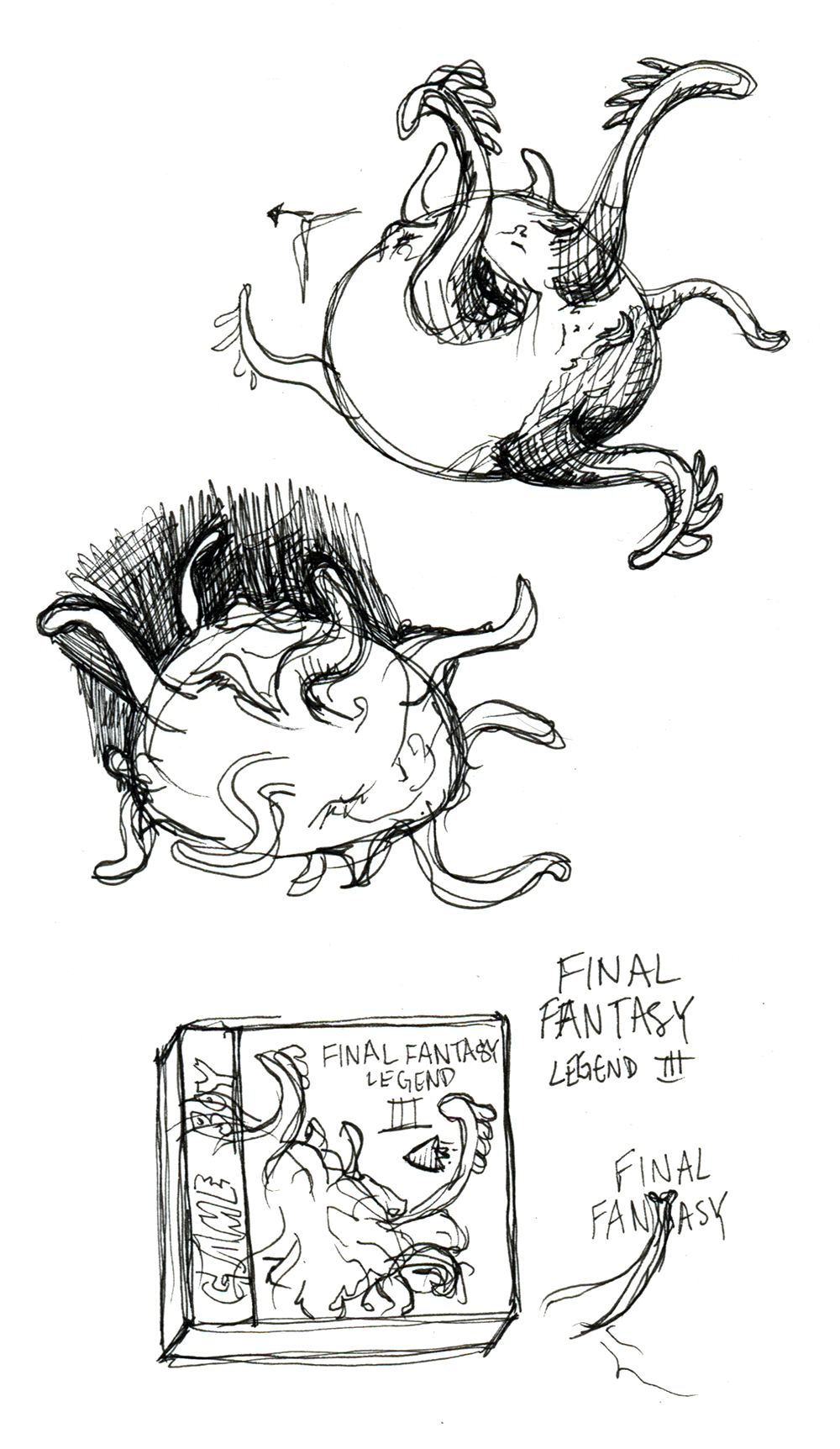
This is hopefully just the first of a few of these I’ll do, all centering on an iconic or slightly-overlooked-but-should-be-iconic monster or villain from an RPG. For FF Legend III, I chose to show Xagor, the game’s final boss, in a battle with the Talon, the game’s signature time-travelling airship. I have plans for a couple other games like FF7, FF9, Chrono Cross, and probably some others that are slipping my mind at the moment.
And that’s about it for this post! Next on my list of projects to work on like a crazy person: Finally finishing Lost In Hong Kong. Have a good weekend!
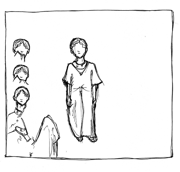
Manic Pixel Dream Girl 1 drawings: second draft
I’m currently in the later stages of completing Manic Pixel Dream Girl 3, so it’s a nice time to look back at MPDG 1 and see how much my process has (or hasn’t) changed since then.
In this post I’ll talk about the second draft of drawings I did for MPDG 1. In case you don’t remember or you didn’t read it, you can find my post on the first draft here. And now, onward!
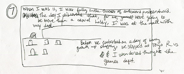
My “complete” second draft for MPDG 1 actually only goes as far as… ALMOST the end, but not quite what the end ended up being. So there are seven “frames,” the first of which is above. I’m really impressed with my own organization… Since this, I’ve gotten a lot LESS strict with myself about creating “official” drafts. There are good and bad things about that, and I actually want to write a post about that later this week, but for now I will stop being openly agog at my own former drafting abilities.
The image above is pretty close to how that part was in the final version. Only I originally envisioned my reaction as progressing horizontally, like it is in this draft. That’s kind of a pattern you’ll notice. I’m so used to reading comics in print that it’s easy to forget, in the draft stage, that I’m not drawing for print; I’m drawing for the internet, which means the mechanic by which readers read is scrolling, not page-turning. And as I think I’ve mentioned before, I try to model myself after amazing especially-for-the-internet comics like this one by Hallie Bateman and this one by Emily Carroll. (You should read that second one aaall the way through to see what I’m talking about!)
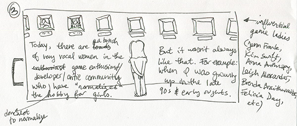
Again, the gallery of influential game ladies started out horizontal, and then I changed it to a staircase to fit the verticality of the medium. I do kind of wish that I could have allowed for the image of me looking at the gallery with my back to the reader, though. I like that (which I had in most early drafts) better than me walking down the stairs, but oh well.
To be fair, I probably would have liked the one of me walking down the stairs better if I had done a better job drawing myself walking down the stairs…
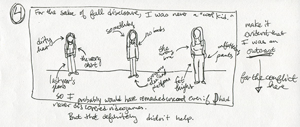
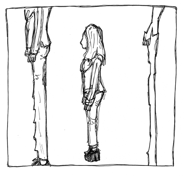
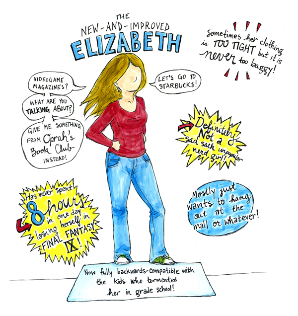
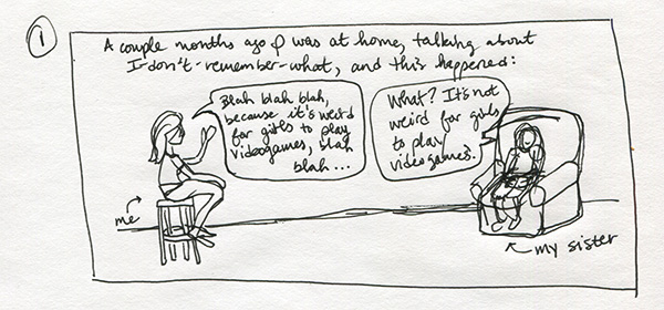
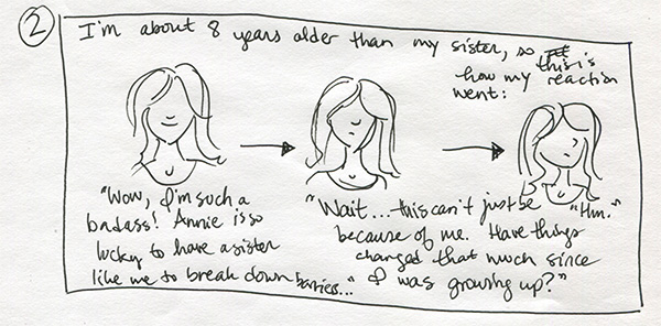
I was originally going to include a much wider range of my own childhood, time-wise, than I did in the final version of MPDG 1. Above I highlighted things about me that were symbols of my “uncool” social status; from left to right, the picture of me is aging from about 8 to about 14. In the end, to keep things clearer and simpler, I made the series more or less chronological, with minimal (and pretty straightforward) flashbacks (flashforwards? I don’t know.). Anyway, the first installment only covered from the age of 8 or so to 11.
It works (I think) that the kinds of things that single you out as being “different” when you’re a child tend to change as you grow up. So what alienated me from my peers at 8 wasn’t necessarily what did it by the time I was 14. Ditto for 18, 22, etc. Categorizing things the way I did above would have smoothed over some of those changes, so I’m glad I didn’t end up doing it that way.
For the record, the final series is organized like this: Part 1 is 2012 then flashback to ~1997-1999 (elementary school); Part 2 is 1999-2002 (middle school); Part 3 is 2012 then flashback to 2002-2006 (high school); and Part 4 will be 2006-nowish (college & after). So structurally, 1/3 and 2/4 are similar, but visually 2/3 and 1/4 are more similar. (Or will be, in the latter’s case.)
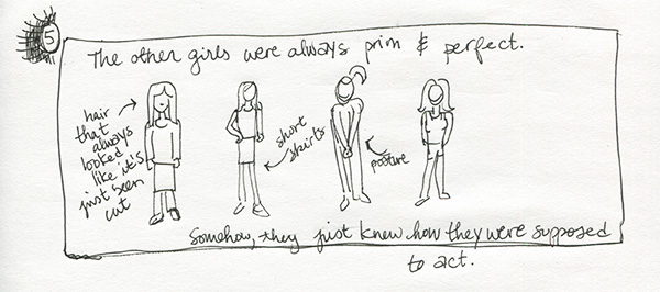
The “prim and perfect” other girls were always more or less how they are above. In the final comic, I added a contextual scene with a couple of them in a bedroom decorated how I imagined “normal” girls’ bedrooms were decorated back in the late nineties. I don’t think I actually ever went over to a “normal” girl’s house as a child (I had one or two close friends who were almost as weird as I was), so it’s all just conjecture, even now…
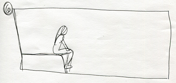
I have no idea what the above clearly-not-finished frame was supposed to be!
Oh wait I think I do. When I started writing MPDG (as a whole, not in parts), one of the incidents that stood out in my memory was this: The other girls were always talking about the Spice Girls, and my only exposure to them was when I heard them playing in a mall or a restaurant or whatever. I’m still kind of bewildered as to how the other girls even found out about the Spice Girls, or that liking them was the “right” thing to do as girls.
Anyway, I pretended I liked the Spice Girls, or at the very least that I knew who they were and what their music was like. Once I sat on the end of my bed (I’m pretty sure that’s what’s in the frame above) and wrote in one of those journals that was more of an activity book that a secret of mine was that I was “the Spice Girls’ biggest fan.” I had maybe ever heard like one of their songs maybe twice. It was insane! Why would I lie TO MYSELF to make myself seem girlier or more normal or whatever? But I did.
I struggled for a long time with how I would incorporate that anecdote into MPDG because I felt (and still feel) like it was emblematic of so much of how strong and internalized those young feelings of alienation can be, and were. Finally, I found a way to imply the story without beating the reader over the head with it, or telling it in a blow-by-blow style like I just did in the last couple paragraphs. Here’s what I ended up doing, and I’m really proud of it. I think the particular experience of translating that memory from rambling to subtle has been one of the most important lessons for me in storytelling, and how different comics are as a medium from straight text.
You’re probably tired of reading this by now, so it’s a good thing I’m at the last panel.
This is again mainly an example of something I ended up changing from primarily horizontal to primarily vertical. I also didn’t include the ending in this draft, which may be because I wasn’t sure what it was going to be yet? Or maybe I was SO sure I didn’t feel the need to storyboard it. I don’t remember.
Anyway, there it is! The second draft (and first FULL draft) of Manic Pixel Dream Girl, Part 1. Hope my lengthy explanations have been helpful rather than irritating and/or tl;dr. Till next time!
What Is Happening: Clip Art & Crustaceans Edition
That’s right: It’s time for another installment of What Is Happening! Here’s some of what I’ve been up to in the last week or so.
1. Uh… Crustaceans: There is seemingly no end to the weird shit I am going to have to learn to draw for this Secret Project I have mentioned a few times before. In this case, it isn’t necessarily that I’m going to have to draw any particular type of shellfish; rather I’m incorporating crustacean-inspired design elements into some stuff, so I’m practicing drawing them to internalize their parts and the ways their anatomy hangs together:
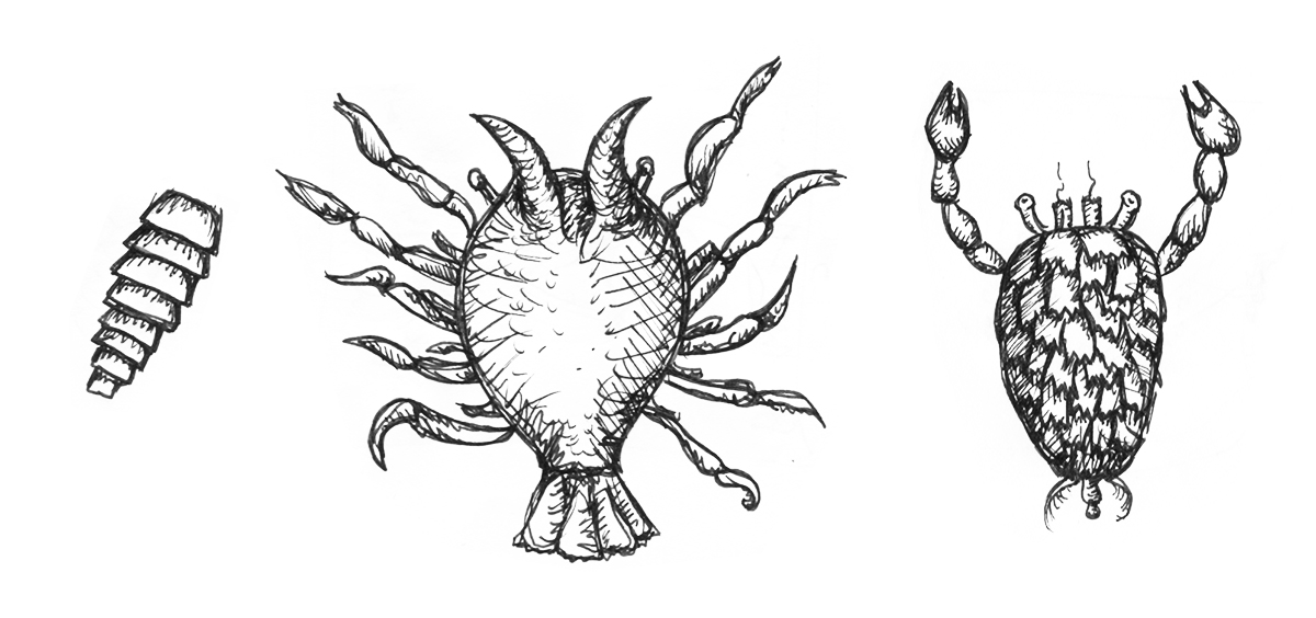
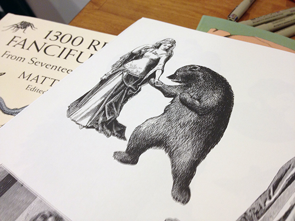
I drew the above things (two terrifying crab-like creatures and I guess a tail?) based on a couple pictures in one of the amazing clip art books—yes BOOKS—that I discovered this week. Which leads me to the next thing that’s been taking up my time…
2. Clip art books are the best thing that has ever happened to me: They are seriously awesome. First of all they only cost like barely anything because all the pictures contained within are in the public domain. Second of all, they are better than the internet because you can have them all in one place and let’s be honest—for visual references, Google image search is ALMOST ALWAYS totally useless. Unless you’re looking for something incredibly specific.
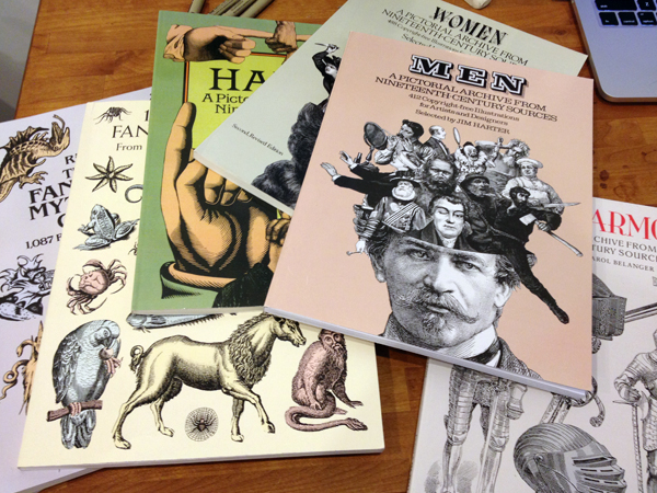
Clip art books are definitely better because I can have pictures of unicorns and men coming out of other men’s heads and overly ornate suits of armor and terrifying crabs without going to the trouble of knowing what I’m looking for before I find it.
For practicing drawing random things, and for fast visual inspiration in well-defined categories, I cannot recommend these more.
And also here is this picture of a woman dancing with a bear, which is going to be very useful in my artistic career:
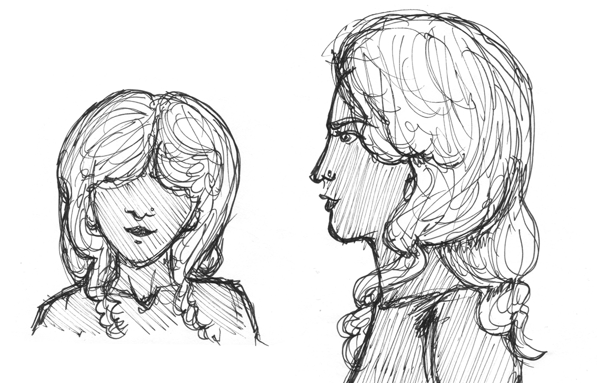
3. Victoria: I did another character design for Secret Project. This is Victoria:
I haven’t figured out what her costume is going to be quite yet, but I have done a design of one of her swords that I’m pretty satisfied with: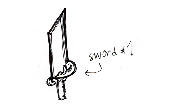
She’s going to carry two of those, which may be very slightly different from one another. They are going to be proportionally ridiculous, in the style of Cloud Strife’s Buster Sword. But TWO TIMES that. Because there will be two swords.
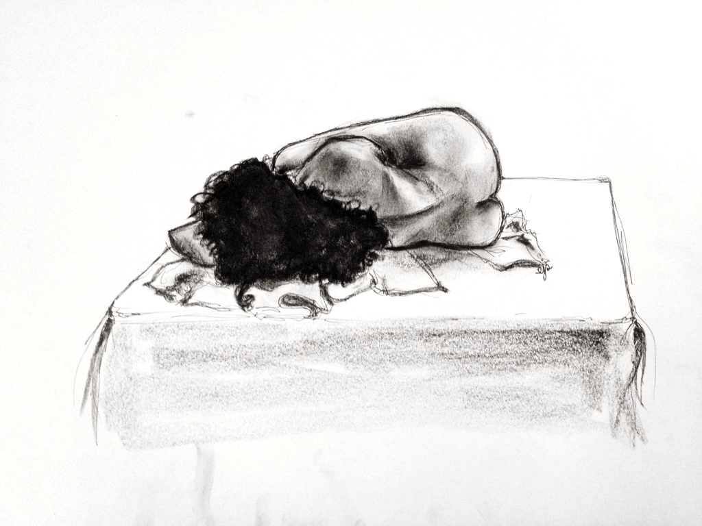
4. 25-minute nude sketch: Here’s another one from my Art Students League life-drawing class. Like last time, I made this with pen and compressed charcoal:
That’s all for the moment—I’m pretty deep into the next piece of Lost In Hong Kong and the first draft of text for part 3 of Manic Pixel Dream Girl, but I’ll blog again soon, promise!
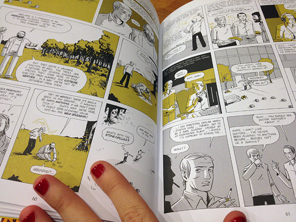
Comic I Love: Tom Kaczynski’s “Beta Testing The Apocalypse”
A great way to get me to read something you wrote/drew/whatever is to put the word “apocalypse” in the title. I kind of love every kind of fiction that imagines apocalyptic or post-apocalyptic worlds, and I’m always interested in weird and different interpretations of that concept. I guess it isn’t particularly original of me, but I think that’s great because it means there’s always more apocalyptic fiction to read!
So anyway, I basically bought this book, “Beta Testing The Apocalypse,” because of its title. Sometimes I’ll just go on Amazon, or walk into Forbidden Planet or whatever, and just pick a few comic books at random. I figure that way I’ll end up discovering awesome stuff at least half the time, which has turned out to be a low estimate, actually.
And it was during one of these wide-net-casting sessions that I found “Beta Testing The Apocalypse,” by Tom Kaczynski.
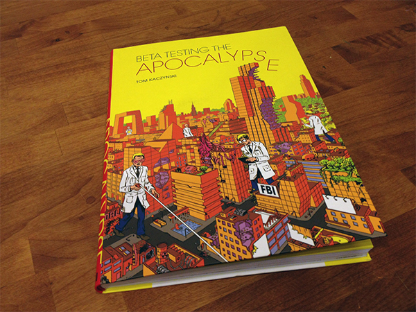
“Beta Testing The Apocalypse” isn’t REALLY about an apocalypse, or apocalypses, as we usually talk about them. It’s more about the ongoing “slow apocalypse” that, according to some (like me! hi there) is HAPPENING EVEN AS YOU READ THIS.
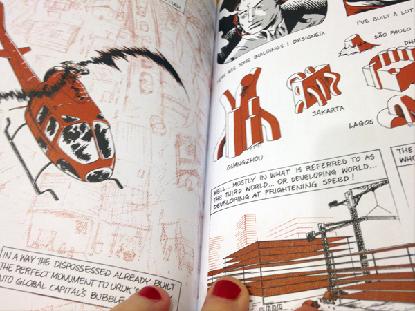
Kaczynski’s conception of the slow apocalypse, which he conveys with a series of vaguely connected short stories, centers around cities and their surroundings and how we (humans, that is) interact with urban development, suburban sprawl, traffic jams, apartment buildings, city sounds, and so on.
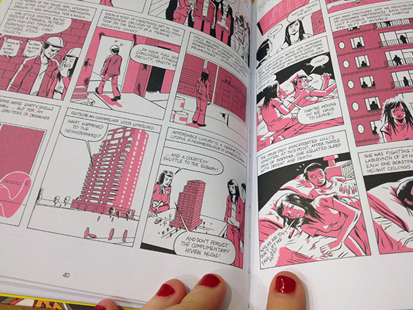
Even though this stuff obviously adheres to a strict definition of “comics,” I found myself thinking of each story more as an illustrated narrative. I know that’s kind of a tricky or at the very least blurry distinction, but Kaczynski’s style involves a pretty dedicated commitment to setting scenes with lyrical descriptions as much as imagery, which is something I associate with the space between “regular” fiction and comics.
I kind of expected to feel like these stories were heavy-handed anti-technological bullshit or something, but instead they’re super nuanced and layered. Their message isn’t that cities and technology are necessarily bad or evil; rather each story looks at how humanity is changed by its relationship to cities and the rapid development of technology and so on. Sometimes that change is negative, but usually it’s just different, and it’s always presented in a balanced & ambiguous way.
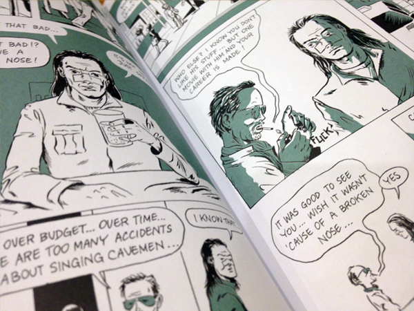
Also, the longer stories are interspersed with one-page short-shorts about noise.
You should read it.