Lost In Hong Kong: Introduction

If you know me, you know that I lack a sense of direction. (It isn’t BAD; rather it is NON-EXISTENT, like this.) I get lost a lot, including in my own neighborhood(s) pretty regularly.

As you might imagine, I get lost even more in unfamiliar locations. Sometimes funny or interesting stories come from times I’ve gotten lost, alone or with others, in exotic places. So I’m making a small series of comics about some of those times. It’s called Lost In, and I’ll be publishing it here as I finish pieces of it.

Oh, and not all of the stories will be about me getting lost because of my directional issues; though some will, there are many reasons we humans get lost. A lack of direction is only one.

Here’s the introduction to Lost In Hong Kong, my first story in the series (click to enlarge):

Lost In Hong Kong: Intro

All Hong Kong cityscapes are based on photographs Tom & I took while on our trip there. Painted with acrylics & water; inked in pen as always.

The next part of Lost In Hong Kong will be available soon! I’m already working on it. :)

Kosher Salt 2: Sketches

Not being classically trained in comics (is there such a thing?), I’ve been learning as I go. Every time I make a new comic, I learn like a gazillion things that I try to apply the next time I make a comic. So I think my stuff kind of gets exponentially better over time, or I hope it does anyway.

On the other hand, learning-by-doing also means (and I have absolutely mentioned this before) that I seriously hate some of my work that I made not even that long ago.

My second Kosher Salt strip, which you can see in its published version here, is a great example of a comic that taught me a great deal at the time, but that I also hate. Quite a lot.

Luckily, I actually prefer the sketches I did for KS #2 over the final product, so writing this blogpost won’t totally suck. (In case you’re wondering, my main issues with the final comic have to do with poorly implemented color, inaccurate portraiture, and clunky lettering. Moving on.)

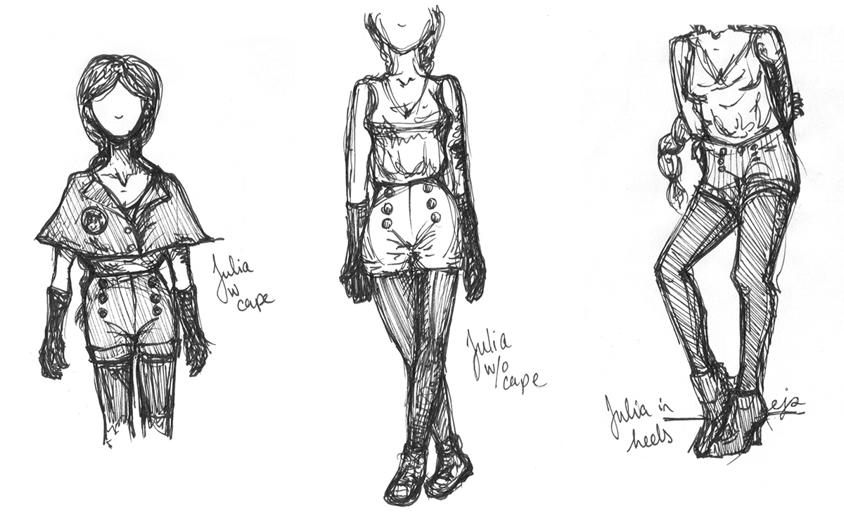
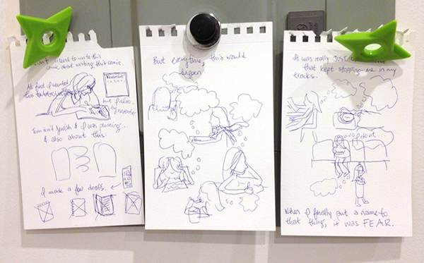
When I first came up with my idea for KS #2, I kind of had the phrase “super Jews” floating around in my head, and I thought maybe it would be funny if I gave them, you know, the superhero treatment.

2-3

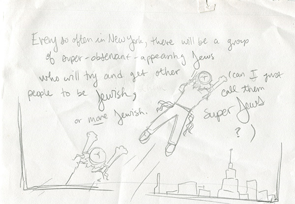
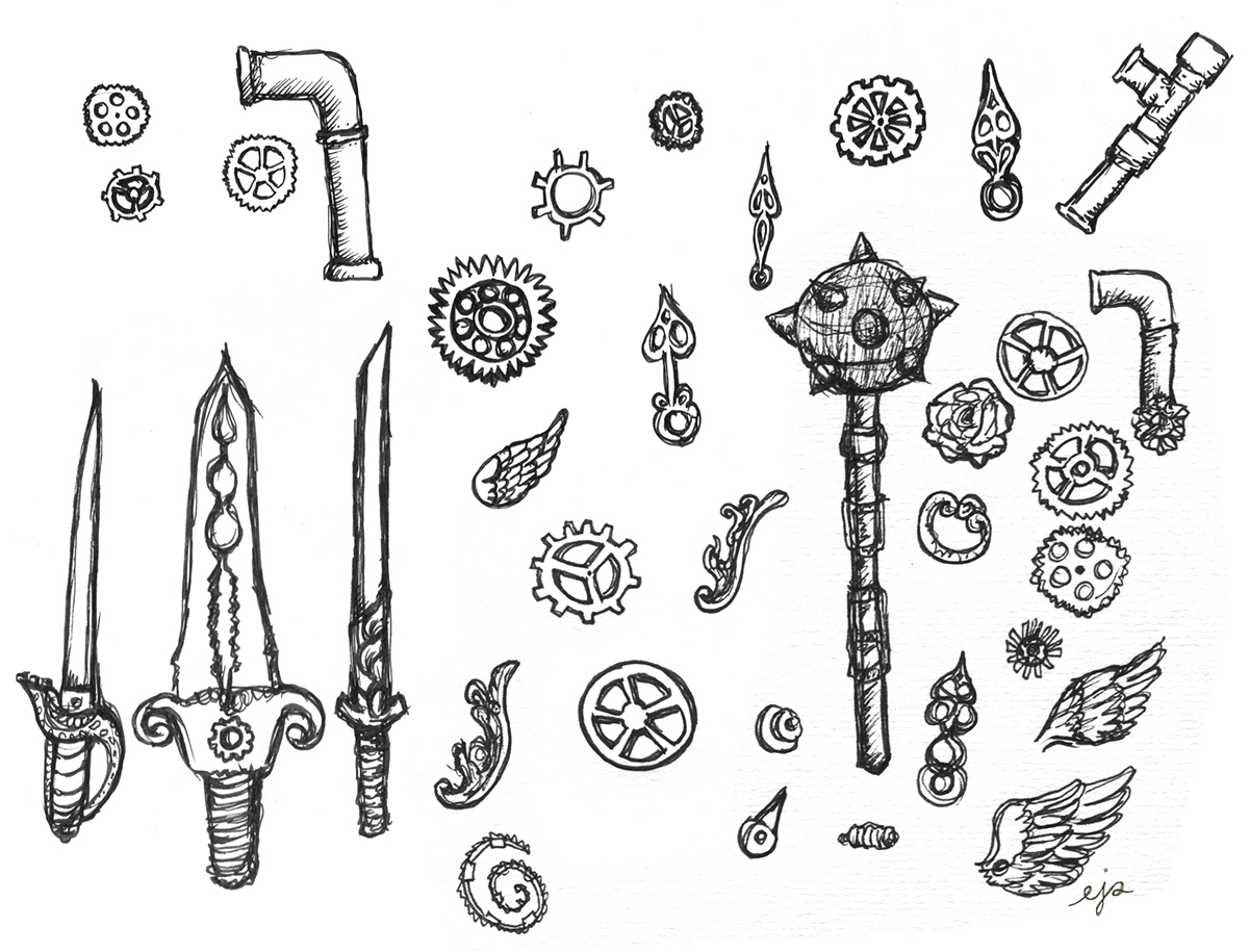
But this is a good example of a visual concept that I didn’t end up using AT ALL—not any element of it.

The problem is that the “super Jews” that this comic covers actually irritate me a great deal. And imbuing them with even metaphorical superpowers seemed like I was elevating their proselytizing brand of Jewishness over my own more unassuming brand. Which goes against the whole point of the comic. So I brought them back down to Earth.

2-2

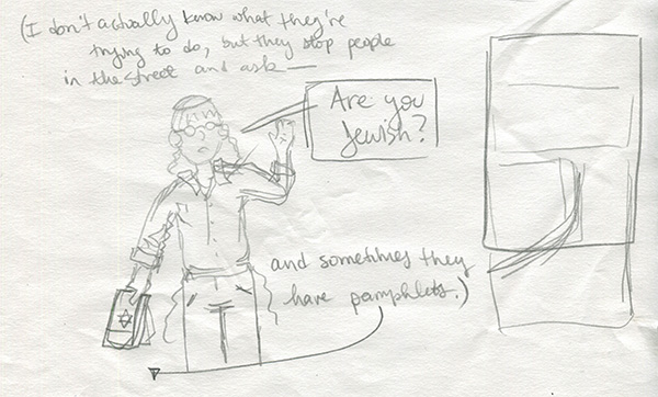
The drawing above is basically what I ended up using, though I threw it into a larger scene, as you can see me start to build on the right.

Below I figured out, on my third try, how I would actually format the comic. (Oh, and note how I approximate the title card in my process sketches. Super precise as you can see.)

2-1

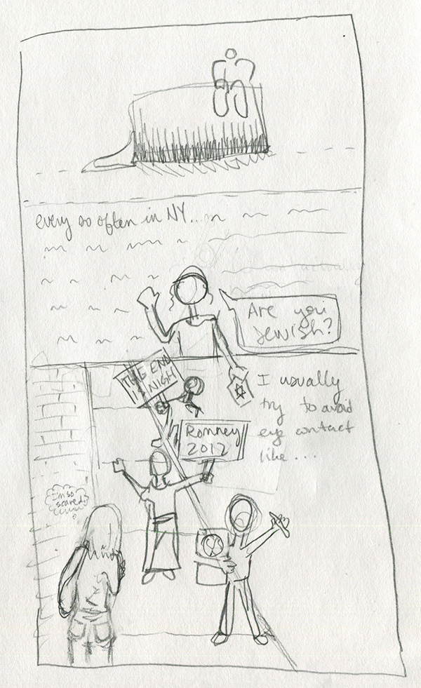
I actually didn’t have the “I’m so scared” thought bubble in the final text that I submitted to my editor, but I thought it would be funny, so I added it on the fly.

It’s too bad I have so many issues with the art of this strip, because I like the narrative arc. In fact, when I collect these into some kind of bound something-or-other, I may refresh the art for KS #1-3 to be more up to the standard I established once I’d figured my shit out, more or less. (KS #4-8)

2-4

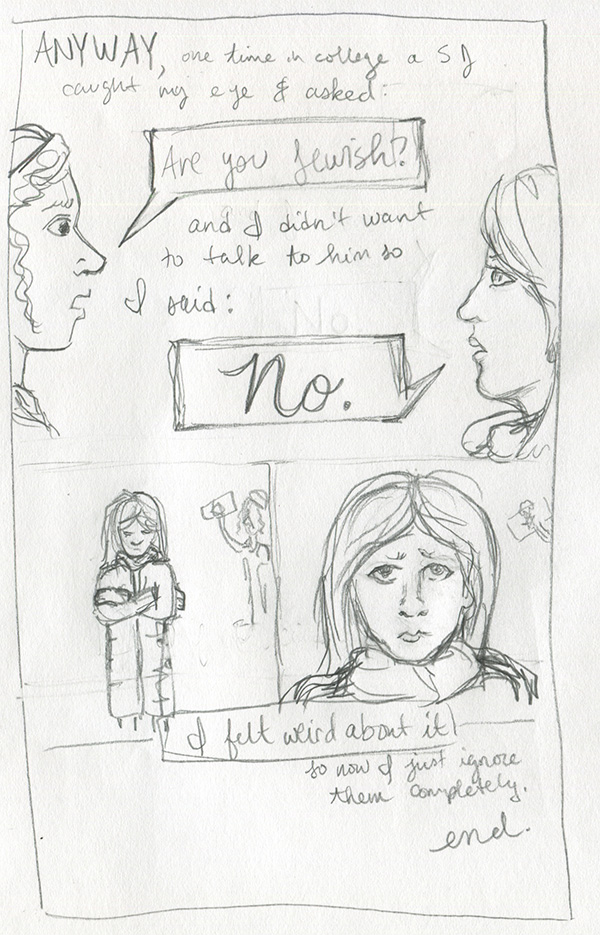
I kept the ending almost exactly the same, except I got rid of the closeup of my face after you see me hunched over in my coat. I think that when I drew the final one, I felt like another shot of my face wasn’t necessary. Either that or I just was having too much trouble getting the eyes right. The world may never know.

What Is Happening: Gears & Gals Edition

Now that I’m doing art full-time, I am (not-surprisingly) drawing A LOT. So I think I’m going to do a regular feature on this blog just kind of taking you through some snippets of what I’ve been doing, maybe every other day or so. May I present to you the first of hopefully many such posts. Enjoy!

1. Elements of Steampunk: For this thing I’m working on, there are a few parts that rely heavily on the steampunk aesthetic, so I’ve been doodling steampunk visual elements to get a hang of them. I am definitely not like “into” steampunk at all, and I often actually dislike it, but daaaamn is it fun to draw:
steampunk-elements
2. Julia: I also am finally happy with one of the primary character designs (not steampunk!!) for that same secret project. Below, meet Julia:

julia-sketches
She’s wearing chunky heels on the right, but she’ll usually be wearing flat lace-up “booties.” God I hate that word. What I mean is, you know, ankle-high boots. Can I just say that instead?

3. 20-minute Nude Sketch: Moving on… Today I started taking a life-drawing class at the Art Students League, which I’ll be doing two mornings a week to keep those particular muscles warm. Here’s my favorite thing I did in today’s class:

20-minute nude
I drew the outlines freehand with pen, and did the shading with compressed charcoal. It was a 20-minute pose.

More soon!

Buffy’s Willow Rosenberg for Jewcy’s Network Jews: sketches

The managing editor of Jewcy is a friend, former co-worker, and fellow Buffy fan, so when she asked me to write something about Willow for their weekly Network Jews feature, I of course said I’d do it.

Usually when I make comics, I write out the copy first. Sometimes that involves scrawling rough ideas over entire pages of carefully blocked-out panels that I had intended to fill with storyboard drawings, and sometimes I sit in front of a Google doc for hours, and sometimes I do what I did for my Willow comic. To see what I mean, here is the first and only rough draft I made:

Willow-1

Irritatingly, I actually like the first Willow portrait I drew (above) more than the final one. Sometimes that happens. Oh well.

Anyway, I guess I had been watching a lot of Buffy in preparation for this piece (my fiancé and I are constantly rewatching that show), so my ideas about Willow’s relationship to her Jewish upbringing were pretty fresh in my mind—enough so that I could basically just write the whole thing in longhand from beginning to end.

Willow-3

For the most part, anyway. Usually the part of any comic that is most difficult for me to write is the part where I have to get to some kind of “point.” Like, it would have been really easy just to list things about Willow and then say, “Oh, and she’s also Jewish,” but not make any meaningful connections between anything. To a certain extent, that’s what I did in my first Kosher Salt comic, which is one of the reasons I don’t really like it in retrospect. (Also because, as you can see if you clicked that link, the image quality is absolutely God-awful. But that’s besides the point.)

With Willow, I didn’t really have any meaningful connections or conclusions in mind when I started drawing the comic, so I just kind of wrote whatever was in my head, and then went back and corrected stuff—by hand—when I decided it wasn’t quite right or was actually horrible.

Willow-2

But as you can see, the pictures actually stayed about exactly the same from draft to final piece.

Also, you may notice that I don’t have a draft for the final few frames of the comic, when Willow visits Tara’s grave, and the final drawing of Willow’s hand crackling with magic. It’s because I got frustrated with my obviously haphazard above method and decided just to write the rest of the copy into a GoogleDoc, after which point I drew straight into the final draft.

Oh! Another decision I made that isn’t evident in these drafts was to color only the characters’ hair. Usually I’d reluctantly admit that I did this because it was easier than coloring the whole thing, but in this case it really was totally deliberate. This comic was, first and foremost, a short essay. The focus was supposed to be the words. So I wanted the drawings to complement, but not overpower. Willow’s hair is so distinctive that I thought (and I think it worked!) I could make it clear that these were drawings of HER, not just anyone, by only coloring her hair. Then I decided to do the others’ too, so it would be clear who Buffy was. After all, these drawings are pretty simple and otherwise it might have been hard to tell…

Artist I Love: Nicholas Di Genova

monsters1

I found this tiny little booklet in the back of the Union Square Forbidden Planet.

monsters2

Designing monsters and uncanny animal things is something I’m interested in learning more about, and it’s surprisingly hard to find resources on the subject.

monsters3

But Nicholas Di Genova‘s stuff has such a level of obsessive virtuosity to it that it’s the perfect thing to have around for inspiration. Like, maybe someday, if I work really hard, I can be like 4% as good at this as this guy is!

monsters4

Or not.

Life changes & exciting new things

Hello!

You may have noticed that I have been keeping a low profile for a couple weeks (also known as “neglecting my blog” but why use such language?). So here’s an update on what’s been going on:

First off, I left my day-job, and I wanted to spend the last couple weeks tying up all my loose ends there. Especially being secure in the knowledge that, when I was finished, I’d be able to devote ALL OF MY TIME to making art & comics & (hopefully) comics that are art.

So now that’s what’s happening: I am going to try my luck at being a full-time artist & illustrator for awhile. If it works out, I’ll be doing it forever. Obviously that’s what I’m hoping for, because as you may have realized, I really really REALLY love drawing and painting, and I want to be able to do what I love.

In the next few months (and hopefully much longer), I’ll be working hard at getting myself off the ground art-wise. I have loads of ideas and plans for various graphic memoirs and paintings and even fictional comics, possibly zines or booklets, definitely prints, and so on. As I work on those things, I’ll be posting progress sketches and the like here, as usual, as well as notes whenever something is published.

If you want to help me fulfill my hopes and dreams & be able to continue creating stuff indefinitely, first of all that makes me really happy. :) And second of all, here are some things you can do:

  • Follow me on twitter.
  • Read this blog & share any posts you particularly like.
  • Get in touch if you need illustrations or other artwork done and you think my work would be a good fit.
  • Keep up with my portfolio, which I update regularly with finished versions of things that I post here while they are in-progress.

Otherwise, just keep being wonderful and supportive, which I assume you are if you made it to the end of this post!

Thanks for reading & wish me luck!
Elizabeth

Kosher Salt 8: storyboards

I’ve been slacking on this blog ALREADY (I’m joking; I have had several concurrent deadlines so this current slacking is just a blip, not something that will eventually become permanent. NEVER FEAR!) and part of that was because I was working on my eighth installment of Kosher Salt.

This particular strip was fraught with difficulty throughout my writing/drawing process, but I actually touch on that in the comic itself (I know, meta, right?) so I won’t go into it here for now.

Instead, here is a picture of my Kosher Salt 8 (FINAL version, not the zillions of unused iterations) storyboard sketches:

8-1

As you can see, it’s pretty rough. But also pretty close to the final comic, in general terms.

More detailed posts soon, promise!

Comic I Love: Robert Hunter’s “The New Ghost”

Remember when I said I would probably be posting about more books from the wonderful Nobrow Press? Well, here I am to make good on my promise.

I don’t want to say too much about The New Ghost by Robert Hunter, because it’s a very very short story that can be read in fifteen minutes, if you don’t linger too long on any one page.

new-ghost1

It’s about a ghost who only recently became a ghost, and his introduction to the ways of the other, more seasoned ghosts.

new-ghost2

The new ghost is especially interested in how the older ghosts interact with living humans.

new-ghost3

It’s kind of a quiet, subtle story that still manages to feel like it has created a big world by the end. The art style enhances this: Hunter uses a muted color palette and none of the black outlines that often separate objects in comics from their backgrounds. But it still manages to be incredibly detailed and expressive…

new-ghost4

…and kind of heartbreaking.

new-ghost5