Giant XXL Special Edition MoCCA Fest Blogstravaganza!

I’ve actually been drawing quite a bit over the past few days, but I’ve been doing so in Maine, where I sadly don’t have access to my scanner. Luckily, I still haven’t blogged EVEN ONCE about the wonderfulness that was my experience at MoCCA Fest NYC last weekend. So this is the perfect opportunity to do that.

Last Saturday, I intended just to “stop by” MoCCA Fest, but I accidentally stayed for about four hours. I talked to a whole bunch of artists all of whom are doing really interesting things in the intersecting worlds of comics and illustration. I also bought a metric shitload of comics:

moccafest_0009_Layer 0

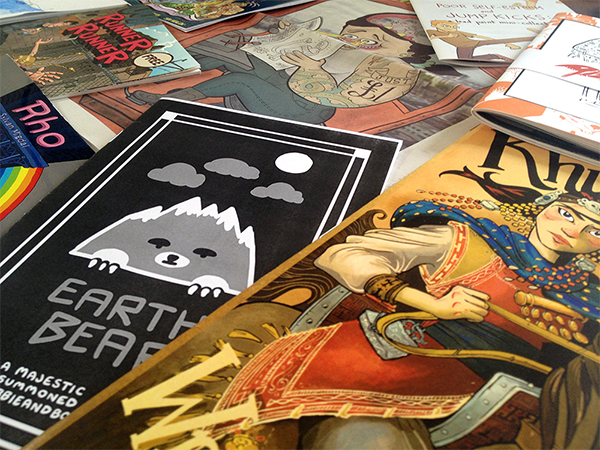
Keep in mind, none of these cost more than $5, and most were $1 or $2, and some were free.

moccafest_0008_Layer 1

And that’s not even everything…

I’ll probably end up doing more posts on some of the comics and, especially, ideas I acquired at MoCCA Fest, but for now I just want to do a round-up of some of the cooler stuff I ended up with. (Generally the reason I have dubbed these comics “cooler stuff” is because they are in richly-printed color, which tends to make my eyes pop out of my head, in a good way, and I do most of my comics in color, so I’m always looking for tips on how to successfully make the transition to print.)

Okay! Let’s go.

moccafest_0000_Layer 9

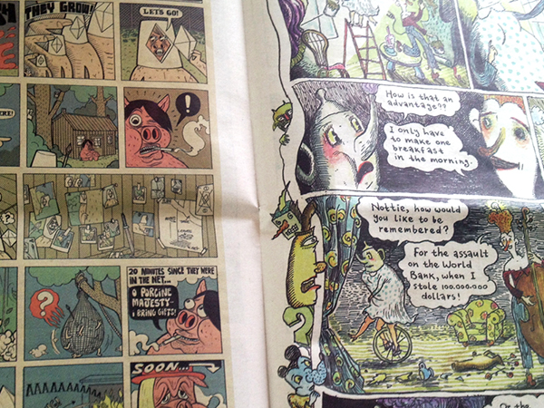
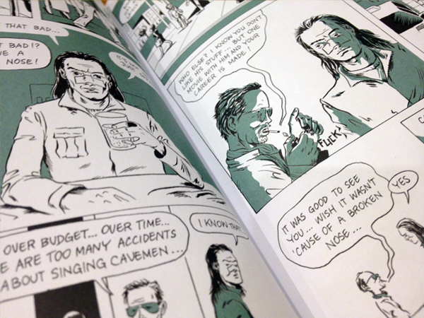
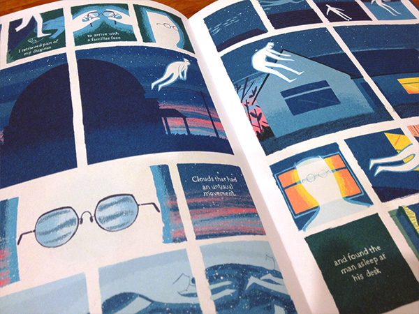
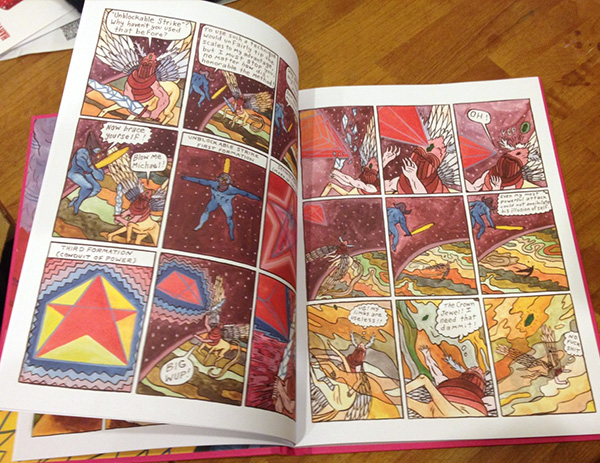
Above is just ONE SPREAD from an issue of the Comix Reader, an ongoing series of anthologies, printed on newsprint, in which each of 20 participating artists gets one page to do with whatever he or she wants. It’s committed to being fun and iconoclastic and hilarious… and it is all of those things. Also, it’s sold for just $1/issue, which means I bought all four that have been published. Aaaand I will absolutely be doing a post dedicated just to these so I’ll move on to the next thing for now. Suffice it to say that the Comix Reader is fucking fantastic.

moccafest_0001_Layer 8

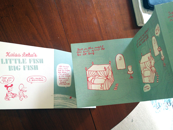
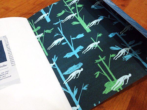
This one, by Kaisa Leka, is kind of important to me because its form is so interesting. Little Fish Big Fish is printed on both sides of a long accordion-style book, which is something I’m considering exploring for print publications of my own. I found it at a table dedicated to Finnish comics, and it smells like an empty crayon box, which is a bit weird but not necessarily a bad thing.

I asked the woman who was tending the table how exactly Little Fish Big Fish was printed and she said it was done on a couple long pieces of card stock, then folded and glued together by hand. Very intriguing.

moccafest_0002_Layer 7

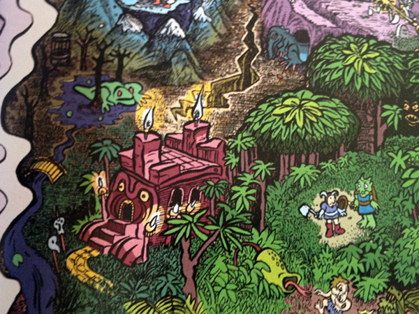
This is a tiny bit of a BEAUTIFUL comic (drawn by Ellis Rosen and colored by Sam Marlow) called HomeQuest. It’s a satire of fantasy quest narratives, especially those found in kind of your run-of-the-mill RPGs, my personal favorite genre of videogame.

moccafest_0003_Layer 6

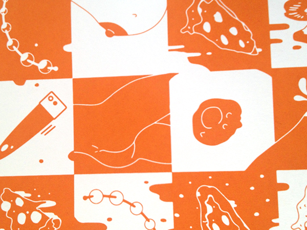
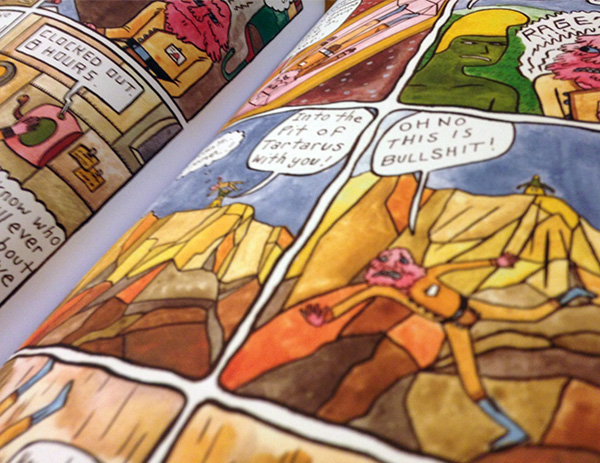
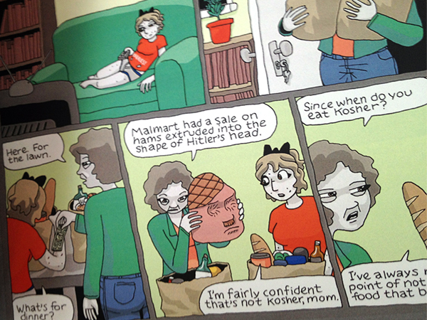
Okay in service of not making this post entirely NSFW, I am only including a small piece of the cover of this anthology which is descriptively titled Pizza and Sex. Inside you can find short comics and visual narratives by a bunch of artists, all about, well… pizza and sex. Some stories have people having sex and eating pizza; some are having sex WITH pizza; there’s also some pizza having sex with other pizza. Basically it’s hilarious, and a well-orchestrated example of a ridiculous concept that ends up inspiring some pretty excellent art.

moccafest_0004_Layer 5

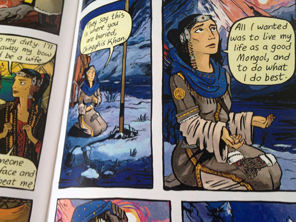
On a um… completely different note, Here’s a part of one of the many gorgeous pages in Molly Ostertag‘s Khutulun, which is based on the true story of a Mongolian princess-slash-warrior. (This is the same artist who does the visuals for the ongoing webcomic Strong Female Protagonist.)

I talked to Ostertag about her process, because I fell in love with her art style—specifically the really delicate-yet-bold way that she colors her work. It turns out she colors in Photoshop! This blew my mind a bit, because I am such a proponent of doing things “the old-fashioned way” when it comes to painting (for my own work; I definitely don’t look down on other people’s methods, regardless of what they are!). Not that I’m going to stop using actual physical paint any time soon, but I am super impressed with how real-actual-paint-ish many artists can make their Photoshop-painting look.

moccafest_0007_Layer 2

Above is a tiny, hysterical piece of Sylvan Migdal‘s Rho. Oh uh… that link is probably NSFW. Sorry bout that.

Anyway, I was already familiar with Migdal’s work on (definitely NSFW) Curvy, which is a lovely, smutty sci-fi/fantasy adventure story. Thing is, I actually was sure that Migdal, who sometimes goes by the pen-name M. Magdalene, was a woman! Maybe it’s just because there are so many different types of queer ladies in Curvy. But when I saw Migdal at his table at MoCCA Fest, I said “Oh, I like Curvy,” and he was like, “Thanks!” and of course I immediately said, “YOU did Curvy?? I thought you were a woman!”

Everyone at the table thought that was pretty funny. Comics: defying gender stereotypes!

moccafest_0006_Layer 3

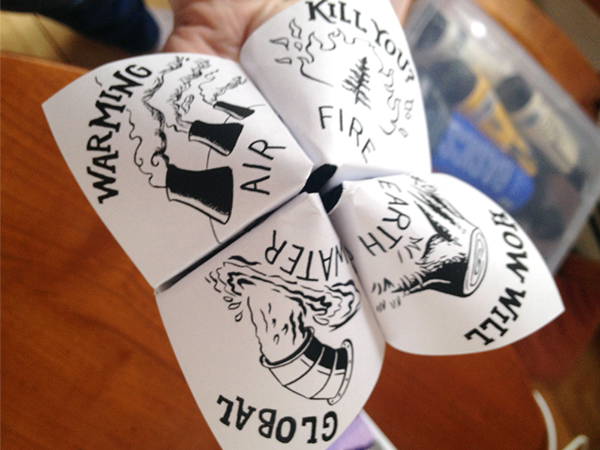
You’ll notice that this last thing isn’t in color. It also isn’t really a comic. But it IS a fortune-teller about global warming. So obviously I had to buy it.

moccafest_0005_Layer 4

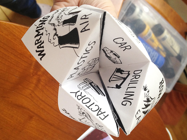
It came in a $2 “grab bag” of comics by Hazel Newlevant.

Whew. Okay, that’s enough for now. I’ll be sure to go into more detail about individual comics at some point, as well as talk about various things I learned from talking to all those artists, other than what I briefly mentioned above. More soon!

Comic I Love: Tom Kaczynski’s “Beta Testing The Apocalypse”

A great way to get me to read something you wrote/drew/whatever is to put the word “apocalypse” in the title. I kind of love every kind of fiction that imagines apocalyptic or post-apocalyptic worlds, and I’m always interested in weird and different interpretations of that concept. I guess it isn’t particularly original of me, but I think that’s great because it means there’s always more apocalyptic fiction to read!

So anyway, I basically bought this book, “Beta Testing The Apocalypse,” because of its title. Sometimes I’ll just go on Amazon, or walk into Forbidden Planet or whatever, and just pick a few comic books at random. I figure that way I’ll end up discovering awesome stuff at least half the time, which has turned out to be a low estimate, actually.

And it was during one of these wide-net-casting sessions that I found “Beta Testing The Apocalypse,” by Tom Kaczynski.

beta-1

“Beta Testing The Apocalypse” isn’t REALLY about an apocalypse, or apocalypses, as we usually talk about them. It’s more about the ongoing “slow apocalypse” that, according to some (like me! hi there) is HAPPENING EVEN AS YOU READ THIS.

beta-2

Kaczynski’s conception of the slow apocalypse, which he conveys with a series of vaguely connected short stories, centers around cities and their surroundings and how we (humans, that is) interact with urban development, suburban sprawl, traffic jams, apartment buildings, city sounds, and so on.

beta-3

Even though this stuff obviously adheres to a strict definition of “comics,” I found myself thinking of each story more as an illustrated narrative. I know that’s kind of a tricky or at the very least blurry distinction, but Kaczynski’s style involves a pretty dedicated commitment to setting scenes with lyrical descriptions as much as imagery, which is something I associate with the space between “regular” fiction and comics.

beta-4

I kind of expected to feel like these stories were heavy-handed anti-technological bullshit or something, but instead they’re super nuanced and layered. Their message isn’t that cities and technology are necessarily bad or evil; rather each story looks at how humanity is changed by its relationship to cities and the rapid development of technology and so on. Sometimes that change is negative, but usually it’s just different, and it’s always presented in a balanced & ambiguous way.

beta-5

Also, the longer stories are interspersed with one-page short-shorts about noise.

You should read it.

Comic I Love: Robert Hunter’s “The New Ghost”

Remember when I said I would probably be posting about more books from the wonderful Nobrow Press? Well, here I am to make good on my promise.

I don’t want to say too much about The New Ghost by Robert Hunter, because it’s a very very short story that can be read in fifteen minutes, if you don’t linger too long on any one page.

new-ghost1

It’s about a ghost who only recently became a ghost, and his introduction to the ways of the other, more seasoned ghosts.

new-ghost2

The new ghost is especially interested in how the older ghosts interact with living humans.

new-ghost3

It’s kind of a quiet, subtle story that still manages to feel like it has created a big world by the end. The art style enhances this: Hunter uses a muted color palette and none of the black outlines that often separate objects in comics from their backgrounds. But it still manages to be incredibly detailed and expressive…

new-ghost4

…and kind of heartbreaking.

new-ghost5

Comic I Love: Jesse Moynihan’s “Forming”

I’ve been reading a billion comics lately, but I had absolutely NO TROUBLE deciding which one to post about first on this blog.

“Forming” by Jesse Moynihan is fucking fantastic. On like at least eight different levels.

forming1

First of all, it is in beautiful vibrant color. I have a giant soft spot for things that are very obviously hand-painted and hand-lettered, and this is like Example #1 of why it is awesome when people do non-digital paintings. Also, I totally get why lots of comics are in black-and-white. And often I like that look a great deal. But there’s something about color…

forming2

It is also worth noting that Vol. 1 of Forming is just like a really pretty book. I’m kind of a luddite about books and print in general, even though I love the internet for lots of things. I have a collection of over 1000 books in my tiny Manhattan apartment (we are VERY creative with space). People are always telling me to get rid of them, but I’m way too attached.

(Forming is published by Nobrow, for the record. They make lots of beautiful books and things. I will probably post about some other stuff of theirs at some point in the near future…)

forming3

Another reason why Forming is awesome: The writing is actually hilarious. It’s basically the story of the origin of humanity on Earth, with lots of biblical stuff thrown in, as well as space aliens. But all the characters use very crass modern slang. Which, if poorly done, would maybe be stupid or obnoxious or whatever. BUT IT IS NOT. It is great.

forming4

In conclusion, go read Forming. NOW. And then once you’ve decided it’s awesome, you should go buy the first volume. Because I want there to be a second volume.