Part 2 (of 4) is live today, and I’m super proud of it. See the whole comic here.
Tag Archives: comics
Kosher Salt 8: storyboards
I’ve been slacking on this blog ALREADY (I’m joking; I have had several concurrent deadlines so this current slacking is just a blip, not something that will eventually become permanent. NEVER FEAR!) and part of that was because I was working on my eighth installment of Kosher Salt.
This particular strip was fraught with difficulty throughout my writing/drawing process, but I actually touch on that in the comic itself (I know, meta, right?) so I won’t go into it here for now.
Instead, here is a picture of my Kosher Salt 8 (FINAL version, not the zillions of unused iterations) storyboard sketches:
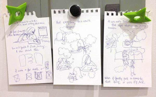
As you can see, it’s pretty rough. But also pretty close to the final comic, in general terms.
More detailed posts soon, promise!
Zora the Cat likes comics too
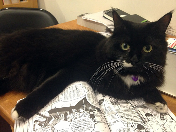
Here she is reading Finder Library Vol. 1 with me.
Kosher Salt 1: sketches
First of all, I just want to get this out of the way: Some of the pages below have been partially eaten by cats.
Moving on.
Since last May, I’ve been doing a semi-regular comic over at Jewcy called Kosher Salt. Over time it’s become a place for me to write & draw about pretty much anything in my life that relates to the fact that I’m ethnically Jewish, religiously nothing, and culturally a mix of a bunch of different things.
It’s also where I’ve been experimenting with and figuring out how I want to draw comics. I did a pretty inconsistent and haphazard comic with my senior-year roommate back in college, and though it was fun, I didn’t really know what I was doing at the time. It’s only since I started Kosher Salt that I’ve been really intentional with my use of space and movement and lettering and pacing and all those other things that people who draw comics are always talking & thinking about.
(You can see the first strip, which I will be talking about in this post, and which I also kind of have very complicated & mixed feelings about, here.)
This is one of the first drawings I did for Kosher Salt:
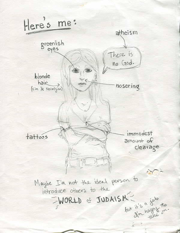
This is obviously a style that is almost completely different from the kind of stuff I do now. Mainly in the face area. Which I tend, now, to leave almost completely blank. Maybe someday I’ll write a blogpost about THAT. But that’s more complicated than just Kosher Salt so I want to keep going for now…
The next one is also from the first strip:
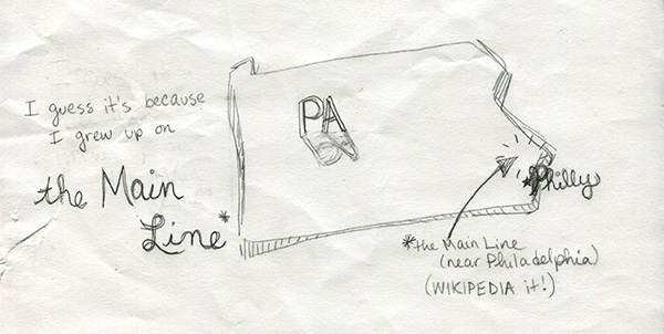
Looking back on it now, this is kind of a case of over-illustration. One of the tricky things I’ve learned about making comics is that sometimes things should be drawn, and sometimes things should be said (written). I guess that seems pretty obvious, but getting the balance right can be really difficult and I think a bunch of my early Kosher Salts reflect that (in that they failed to do it effectively). Things I’m doing now also sometimes fail, of course, but at least now I’m aware of it, so usually I think I do an okay job at recognizing problem areas in early drafts.
What I mean to say is, in the picture above, I probably didn’t have to draw the entire state of PA. It’s not necessary to get the point across. But at the time I was really concerned with making sure that EVERY WORD had a CORRESPONDING ILLUSTRATION!! In real life and good comics, artists are able to strike a balance. (Here’s an awesome comic by Anne Emond that does exactly that.)
And oh, finally, something I’m actually still happy with (!):
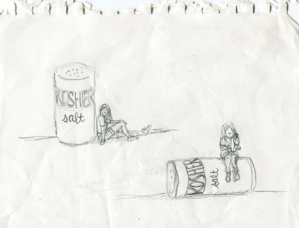
These were my sketches for Kosher Salt’s title card, which has stayed almost exactly the same as the drawing on the bottom since the first strip. I actually mainly ended up choosing the one I did because I have a big tattoo on my left calf, and I wanted it to be visible in the title card. (It’s important because Jews aren’t supposed to get tattoos.) And also I thought the salt-shaker being knocked over fit better with my overall not-quite-fitting-into-Judaism premise.
I didn’t really storyboard my first strip, which is why I don’t have sketches of that in this post. On the other hand, maybe I’m remembering wrong and I did storyboard it, but my cats consumed those pages whole. It’s entirely possible. Thank you for reading!
Concept for a small piece of a large (secret) project
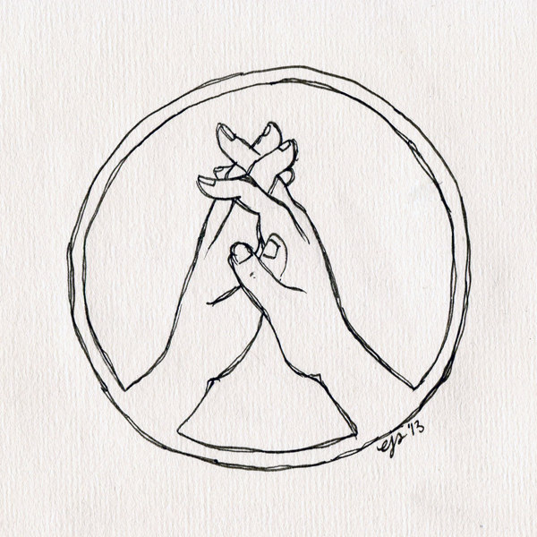
I’m working on kind of an extensive project (spoiler: it’s a comic.. thing) with a friend of mine. Here is a concept for a seal or crest from aforementioned Secret Project.
Eventually, I’d like to make the edges a little more ornate & distinctive, but what was important to get done at this stage was the basic composition of the circle. Decorative stuff will come later… Also I have no idea yet what the colors are going to be for this. I haven’t yet decided if they should be somewhat naturalistic or very logo-ish like maybe just two colors total (the hands and border white, for example, and the negative space black). Maybe next time I post this or another crest I’ll have figured that out….
(I’ll definitely be posting lots more cryptic stuff from Secret Project in the next few months… It has begun to consume a nice-sized chunk of my life.)
Comic I Love: Jesse Moynihan’s “Forming”
I’ve been reading a billion comics lately, but I had absolutely NO TROUBLE deciding which one to post about first on this blog.
“Forming” by Jesse Moynihan is fucking fantastic. On like at least eight different levels.
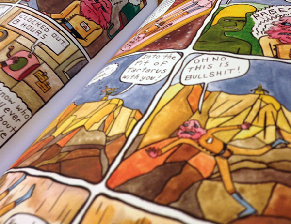
First of all, it is in beautiful vibrant color. I have a giant soft spot for things that are very obviously hand-painted and hand-lettered, and this is like Example #1 of why it is awesome when people do non-digital paintings. Also, I totally get why lots of comics are in black-and-white. And often I like that look a great deal. But there’s something about color…
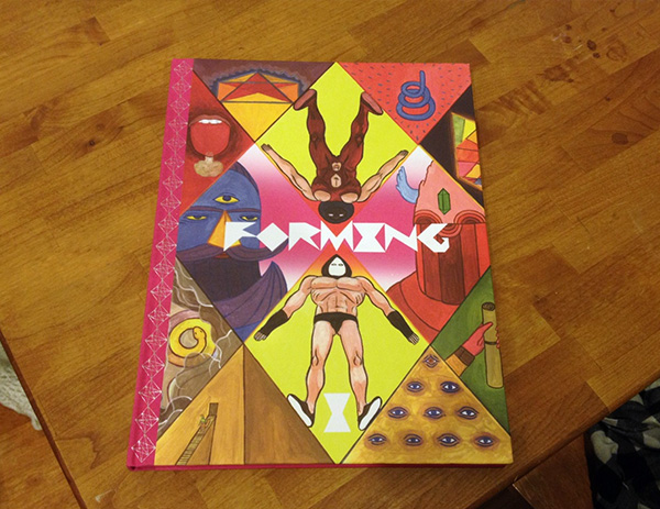
It is also worth noting that Vol. 1 of Forming is just like a really pretty book. I’m kind of a luddite about books and print in general, even though I love the internet for lots of things. I have a collection of over 1000 books in my tiny Manhattan apartment (we are VERY creative with space). People are always telling me to get rid of them, but I’m way too attached.
(Forming is published by Nobrow, for the record. They make lots of beautiful books and things. I will probably post about some other stuff of theirs at some point in the near future…)
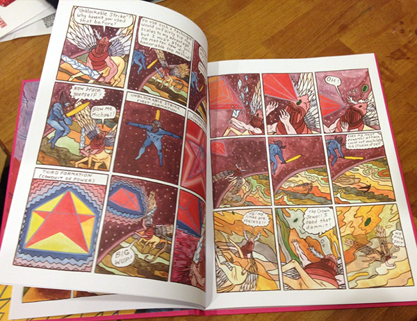
Another reason why Forming is awesome: The writing is actually hilarious. It’s basically the story of the origin of humanity on Earth, with lots of biblical stuff thrown in, as well as space aliens. But all the characters use very crass modern slang. Which, if poorly done, would maybe be stupid or obnoxious or whatever. BUT IT IS NOT. It is great.
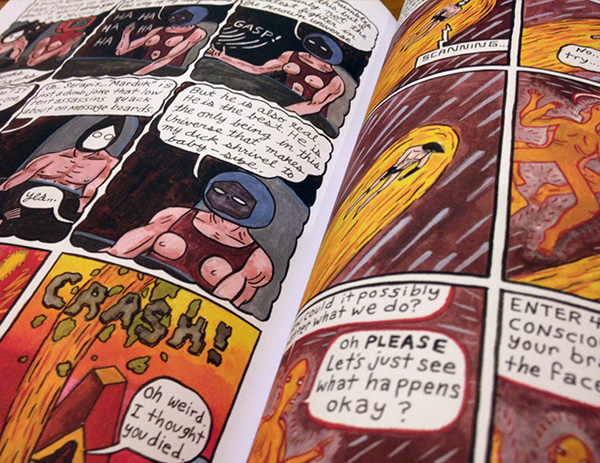
In conclusion, go read Forming. NOW. And then once you’ve decided it’s awesome, you should go buy the first volume. Because I want there to be a second volume.
Manic Pixel Dream Girl drawings: first draft
The Bygone Bureau recently published part-one-of-eventually-four of my comic, Manic Pixel Dream Girl. I’ve been thinking about writing something about growing up as a girl who played videogames for awhile now (like four or five years), so when I finally decided to get to work, it took me a long time to distill all my ideas down to something that made sense and that I was happy with. As a result, there are A LOT of different drafts & versions of MPDG1.
Here’s the first version, which I did around Thanksgiving:
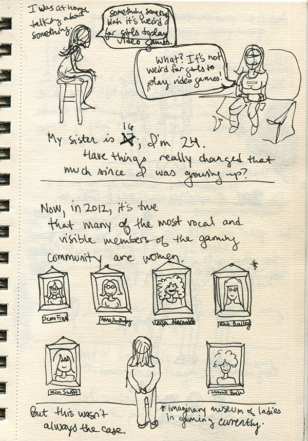
Those panels (though they weren’t such defined “panels” in the final comic) actually stayed pretty similar, though I did end up making the “imaginary museum of ladies in gaming currently” into something more like a gallery on a staircase so there would be some feeling of movement, which I think is important for the medium (of internet comic). I owe a lot to the Bygone Bureau’s Hallie Bateman for exemplifying that internet-comic-vertical-movement idea in her work. Her Cemetery Wonderland is something I look at CONSTANTLY when I’m drawing comics.
Anyway! Next page:
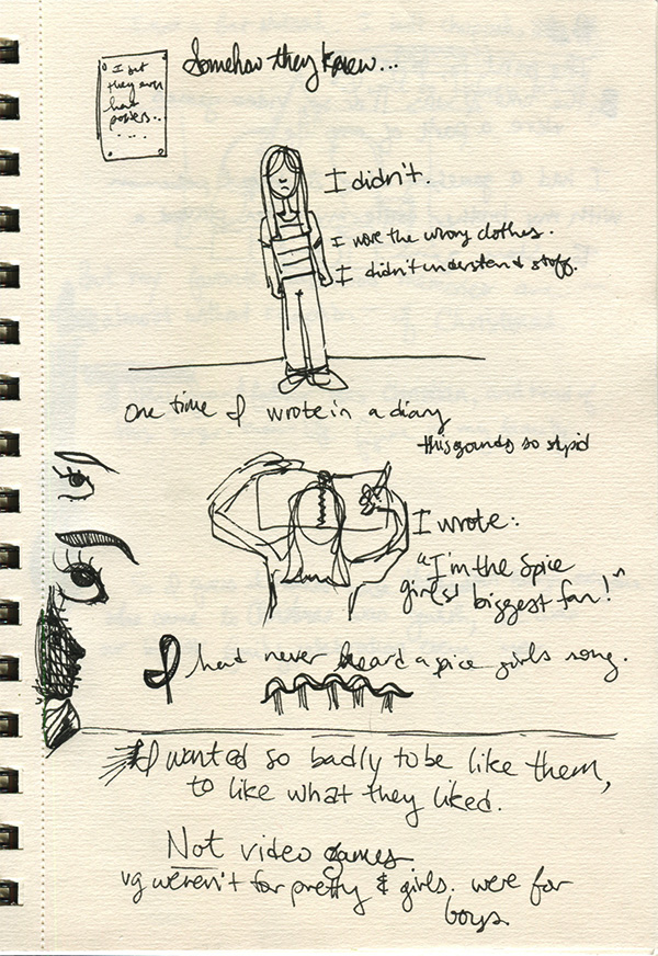
These, on the other hand, were way more nebulous and took a lot longer to solidify in my head, and also on paper. I especially had a REALLY hard time figuring out how to convey the childhood lunacy that caused me to lie to myself in my own diaries. I worked through probably like five versions of that “scene” in my life before it clicked for me. And I’m happy with how it turned out.
I was going to post MORE of my process sketches for MPDG in this post, but I didn’t want to overwhelm y’all this early on! I will follow this up with other versions & drafts.
Hey look, it’s a blog with things on it!
Here’s a quick welcome post:
Welcome! If you’re here you probably already know me. But if not, click the question words above to find out who I am.
So about this blog, here are the sorts of things I will be posting here:
- Drafts and early versions and studies for various comics and paintings and whatnot
- Random drawings that, without this blog, would be homeless
- Stuff about what art I’m currently in love with, which will often be comic books I’m reading
- Probably some stuff I haven’t thought of yet
Okay, I won’t keep you any longer! Oh, one more thing: PLEASE give me feedback. I haven’t blogged in ages and I’ve never really done a blog like this. I promise I’m okay at taking criticism.
Much love,
Elizabeth
