First of all, I just want to get this out of the way: Some of the pages below have been partially eaten by cats.
Moving on.
Since last May, I’ve been doing a semi-regular comic over at Jewcy called Kosher Salt. Over time it’s become a place for me to write & draw about pretty much anything in my life that relates to the fact that I’m ethnically Jewish, religiously nothing, and culturally a mix of a bunch of different things.
It’s also where I’ve been experimenting with and figuring out how I want to draw comics. I did a pretty inconsistent and haphazard comic with my senior-year roommate back in college, and though it was fun, I didn’t really know what I was doing at the time. It’s only since I started Kosher Salt that I’ve been really intentional with my use of space and movement and lettering and pacing and all those other things that people who draw comics are always talking & thinking about.
(You can see the first strip, which I will be talking about in this post, and which I also kind of have very complicated & mixed feelings about, here.)
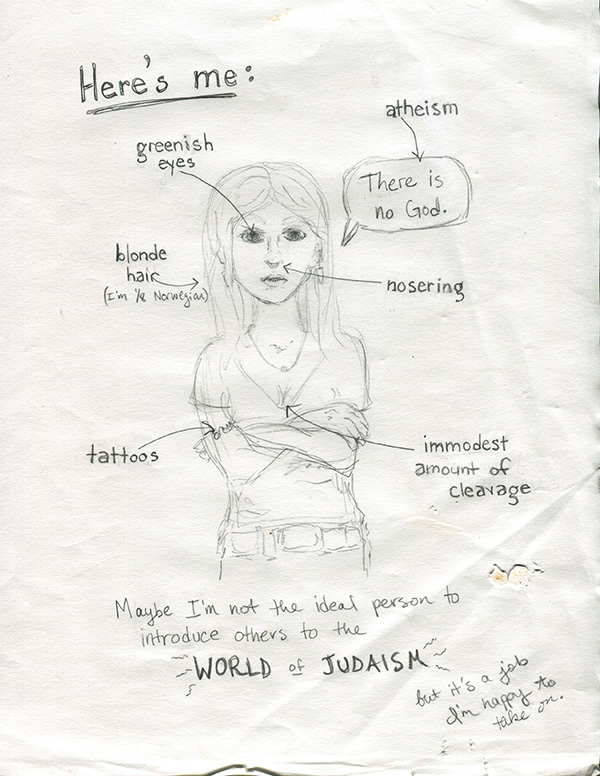
This is one of the first drawings I did for Kosher Salt:

This is obviously a style that is almost completely different from the kind of stuff I do now. Mainly in the face area. Which I tend, now, to leave almost completely blank. Maybe someday I’ll write a blogpost about THAT. But that’s more complicated than just Kosher Salt so I want to keep going for now…
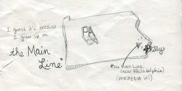
The next one is also from the first strip:

Looking back on it now, this is kind of a case of over-illustration. One of the tricky things I’ve learned about making comics is that sometimes things should be drawn, and sometimes things should be said (written). I guess that seems pretty obvious, but getting the balance right can be really difficult and I think a bunch of my early Kosher Salts reflect that (in that they failed to do it effectively). Things I’m doing now also sometimes fail, of course, but at least now I’m aware of it, so usually I think I do an okay job at recognizing problem areas in early drafts.
What I mean to say is, in the picture above, I probably didn’t have to draw the entire state of PA. It’s not necessary to get the point across. But at the time I was really concerned with making sure that EVERY WORD had a CORRESPONDING ILLUSTRATION!! In real life and good comics, artists are able to strike a balance. (Here’s an awesome comic by Anne Emond that does exactly that.)
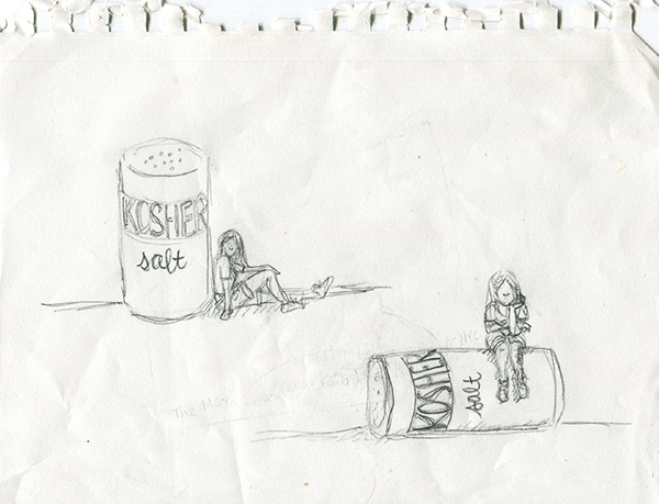
And oh, finally, something I’m actually still happy with (!):

These were my sketches for Kosher Salt’s title card, which has stayed almost exactly the same as the drawing on the bottom since the first strip. I actually mainly ended up choosing the one I did because I have a big tattoo on my left calf, and I wanted it to be visible in the title card. (It’s important because Jews aren’t supposed to get tattoos.) And also I thought the salt-shaker being knocked over fit better with my overall not-quite-fitting-into-Judaism premise.
I didn’t really storyboard my first strip, which is why I don’t have sketches of that in this post. On the other hand, maybe I’m remembering wrong and I did storyboard it, but my cats consumed those pages whole. It’s entirely possible. Thank you for reading!
Pingback: Kosher Salt 2: Sketches | b-sides & rarities by elizabeth simins